THE BRIEF
Tabea Kraska is a business coach for female professionals looking for a change in their career and life. For her it is all about rediscovering the strengths of her clients (which they may never have known they had).
She only had a very limited online presence and needed a branding and logo design that represented her business in the best light without making things overly complicated for her.
I consulted with her about her needs first and prioritised them so she could work with the results as quickly as possible. We needed a logo with accompanying style sheet so she could confidently start, then some stationery and finally a website.
The previous blog/website
THE PROCESS
THE LOGO
The logo design was at the core of the complete branding. Tabea wanted a light, modern feel that matched her outgoing personality and a lean to the more professional side as she is coaching professional working women.
It had to have a feminine touch without drifting too far into “girly” world.
Coral was one of her personal colour favourites and was a strong candidate for the logo.
The first step was to establish some parameters together the client for the whole brand. We brainstormed, discussed and looked for inspiration images together.
To Tabea it was important to incorporate her personal colour, a warm coral and to combine the professional side with the lighter soul searching side of her coaching business. She identifies with Christian Religion and we also explored if elements of that would benefit the logo.
I experimented with a lot of hand drawn typography elements (although vectorised later) and how the initials of her name could kickstart the logo design.
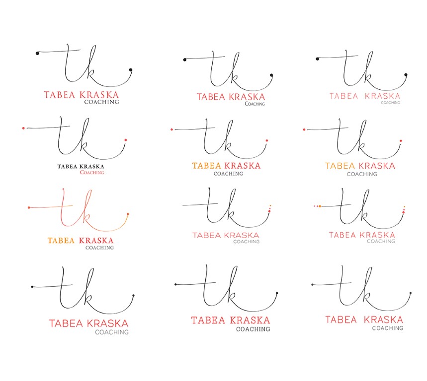
Once the favourite was picked, we looked for the perfect typeface combination with the custom vector drawing of the initials. Also colour variations, small decor elements and other details were tested. The crossbar height of the initials design was also changed to see the effect on the whole drawing.
In the end a very clean sans serif font was chosen and coloured in bright coral, and the name initials drawing in a dark grey colour pairing. This way, both sides of her business, the light hearted and the professional, were encompassed.
The name initials design brings flow and dynamism into the design, while the clean business name design refers back to her corporate influences.
The finished piece is now close to the original concept. However, knowing that alternatives were considered helped the client reaffirm and identify with the final choice.
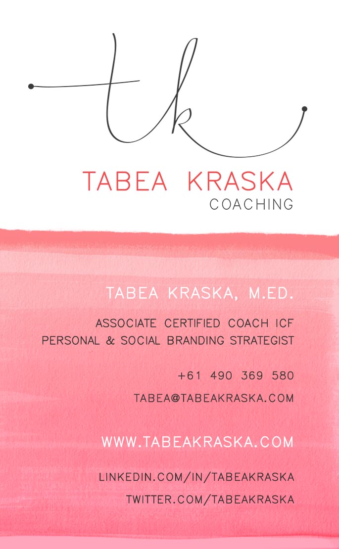
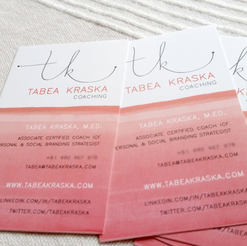
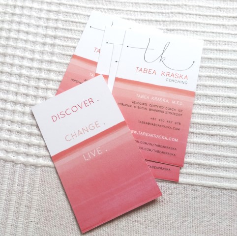
STATIONERY DESIGN – BUSINESS CARD
The business card evolved from the logo design and the style sheet I created for Tabea beforehand.
We had a coral and grey colour palette, the typeface and the idea to use coloured textures as a background.
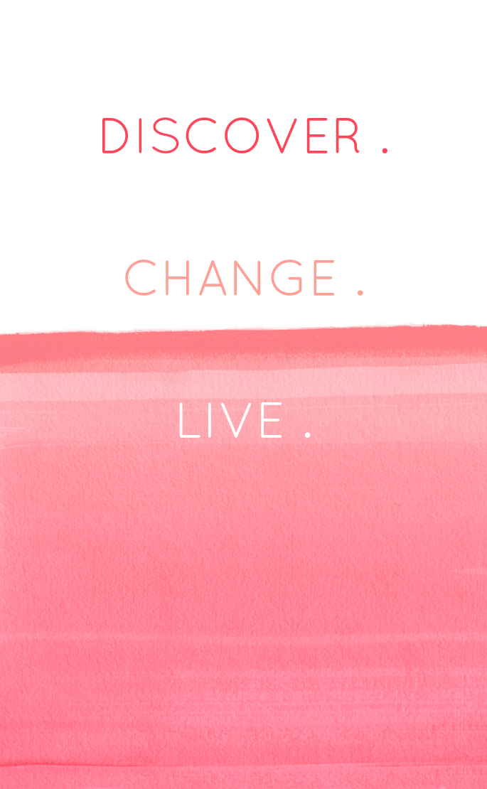
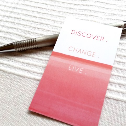
Another important idea was to use the back side as a kind of motivational card, so that clients could put it up on their pinboard as inspiration, but also keep Tabea’s motto in their minds and the card in their wallets.
The textured paint flows from one side to the other and also separates the text out to make it easy to read.
STATIONERY DESIGN – LETTERHEAD
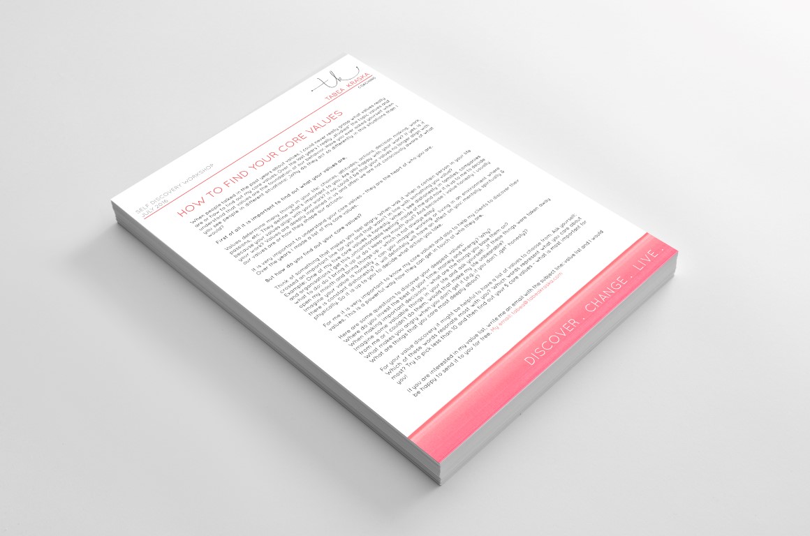
As Tabea will create online and printed documents for her clients, a simple letterhead design was created for these needs. It suits workshops or downloadables and is easily adapted. She also received it as a Word Template so it is ready to go when she wants to draft up something for her clients.
It shows the logo and her motto tagline in the header and the footer, so all necessary info is included but at the same time plenty of space is left for the content.
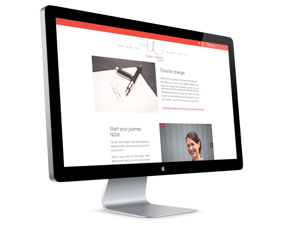
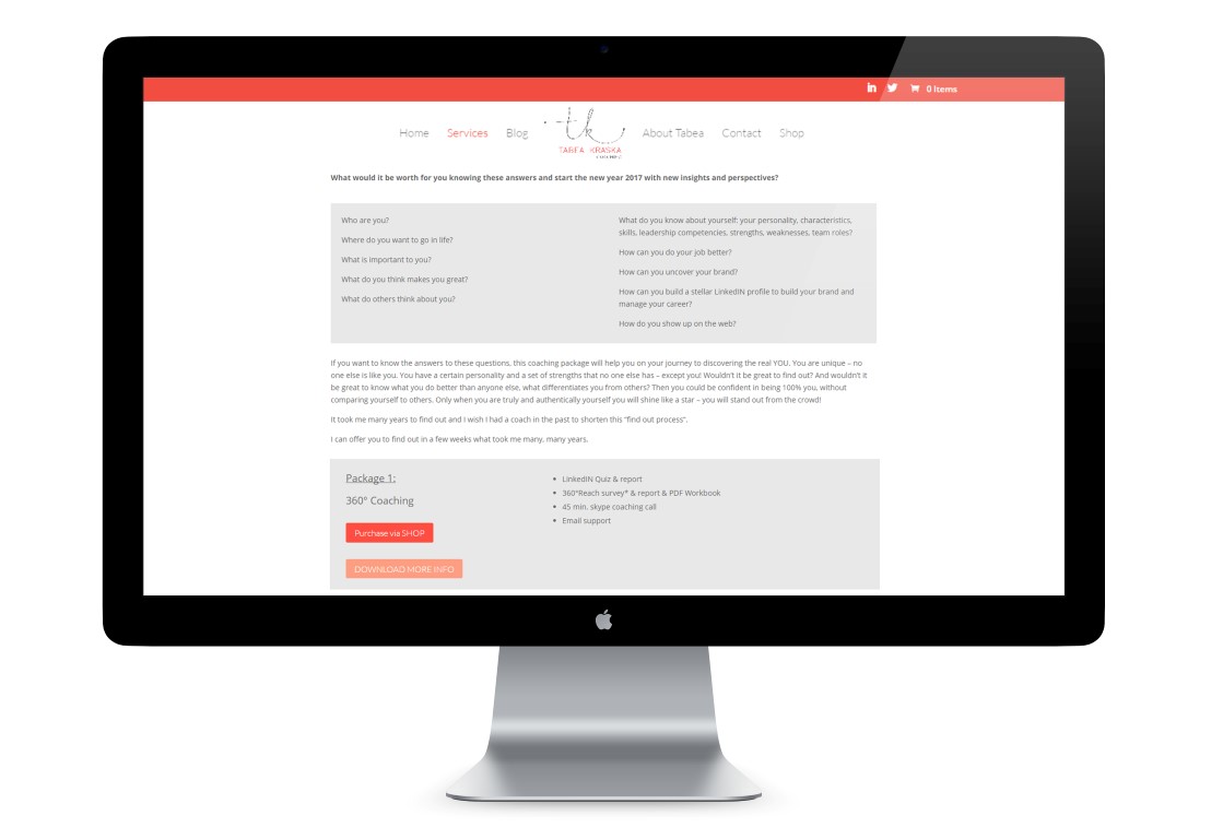
WEBSITE DESIGN
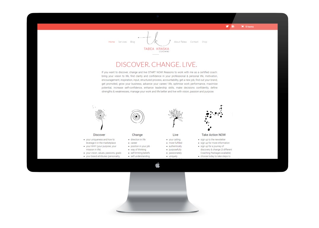
The website needed a strong landing/home page, a services and about page, plus an ecommerce section to make coaching packages available for instant purchase.
On the main page, newsletter sign ups were needed, a way to explain complex information in an easy to read way and a section for testimonials and certifications, all in addition to general info.
STYLESHEET