THE BRIEF
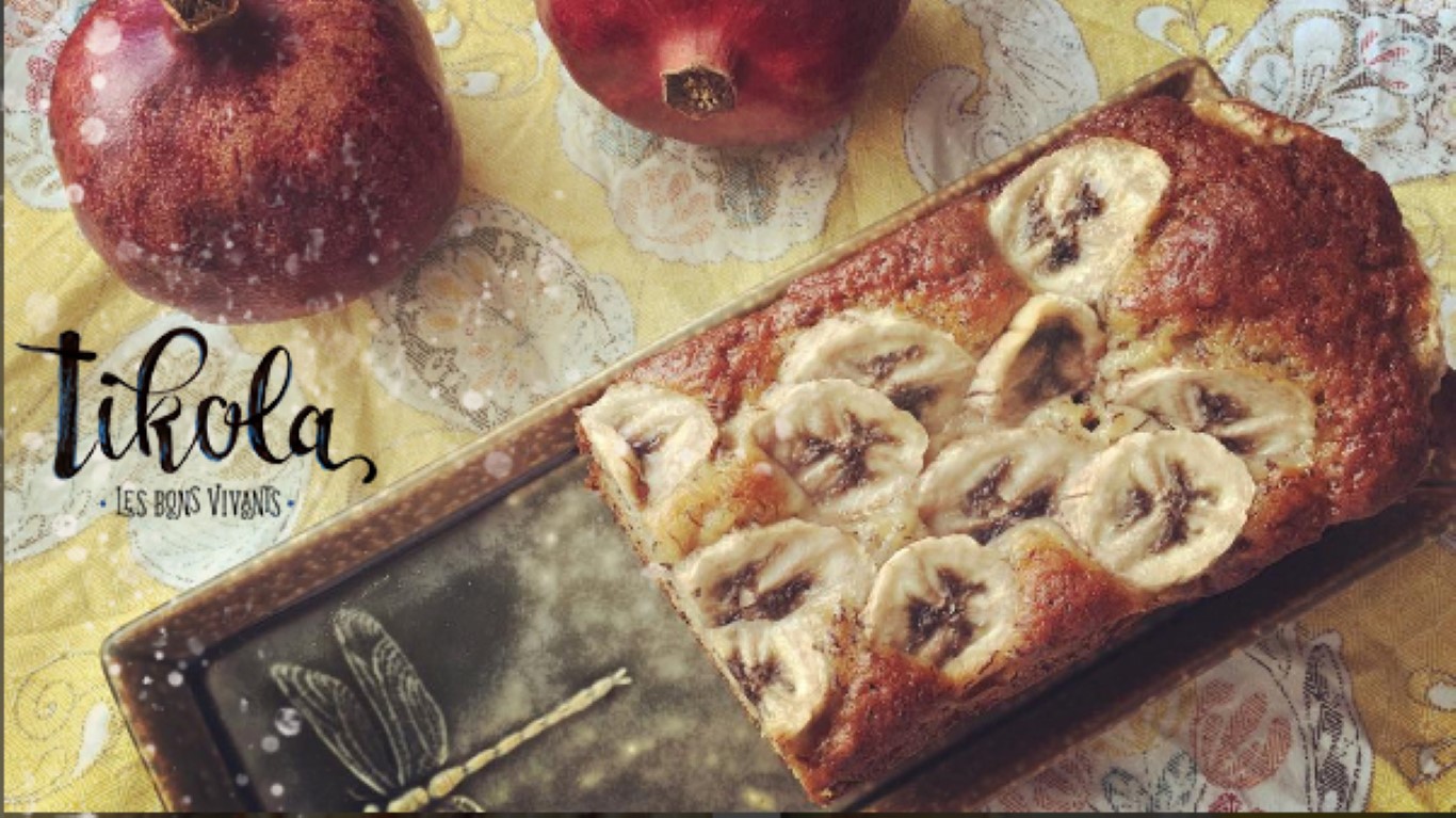
TIKOLA is a food catering company that is run by 2 women who have Eastern European backgrounds and who have had various influences in their excellent cooking and baking skills. From Georgian to German and French cuisine, the traditions and specialties of these countries are part of their cooking style and their food invites to long dinners with friends, wine and a homely, old world charm.
Key to the design and branding was that laid back, vintage feel that reminds of the European country food culture and long summer nights.
The research included natural linen fabrics, olive branches, warm, earthy colours, painted crockery with classic designs, antique cooking tools and silver cutlery.
THE PROCESS
The first concepts included all the above elements in various ways and styles. Some are more on the elegant side while the others have more of the country look with a more relaxed style. The quirky aspect can come from typography or drawing style.
I also tested more Eastern and more Western European artwork in the designs as well.
THE RESULTS
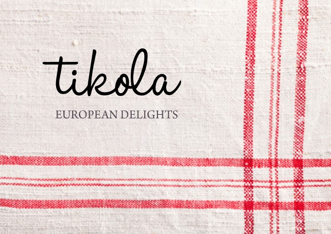
THE LOGO
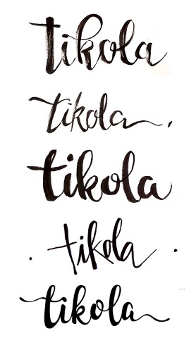
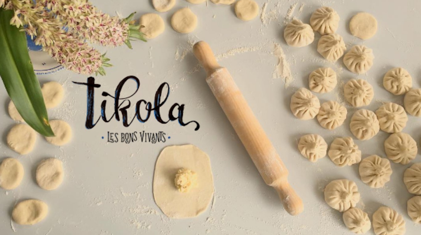
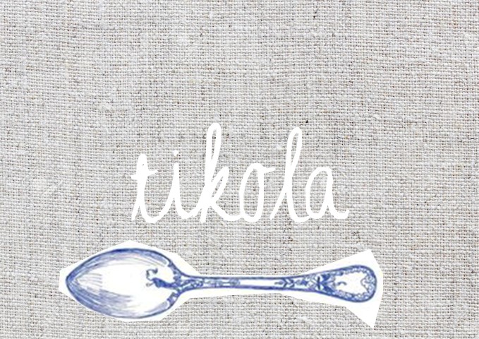
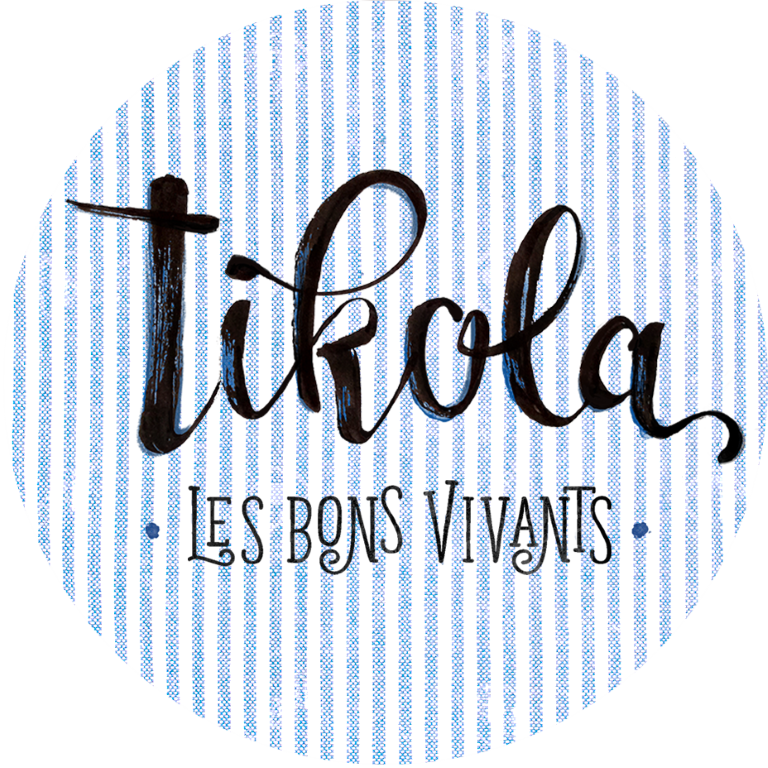
For the logo, a hand lettered design was the choice after some consideration as it is about the handmade. All the food is lovingly created from scratch and the logo should represent that philosophy.
I created several pages of handlettered typographic logo designs to pick from.
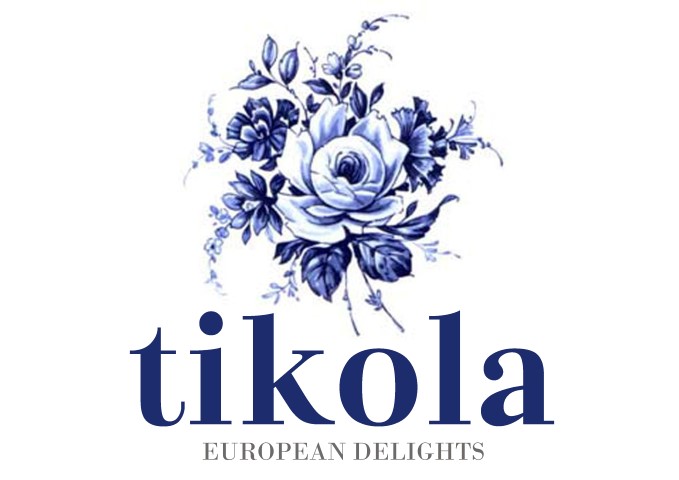
The final choices were given more treatments with the tagline and decor elements.
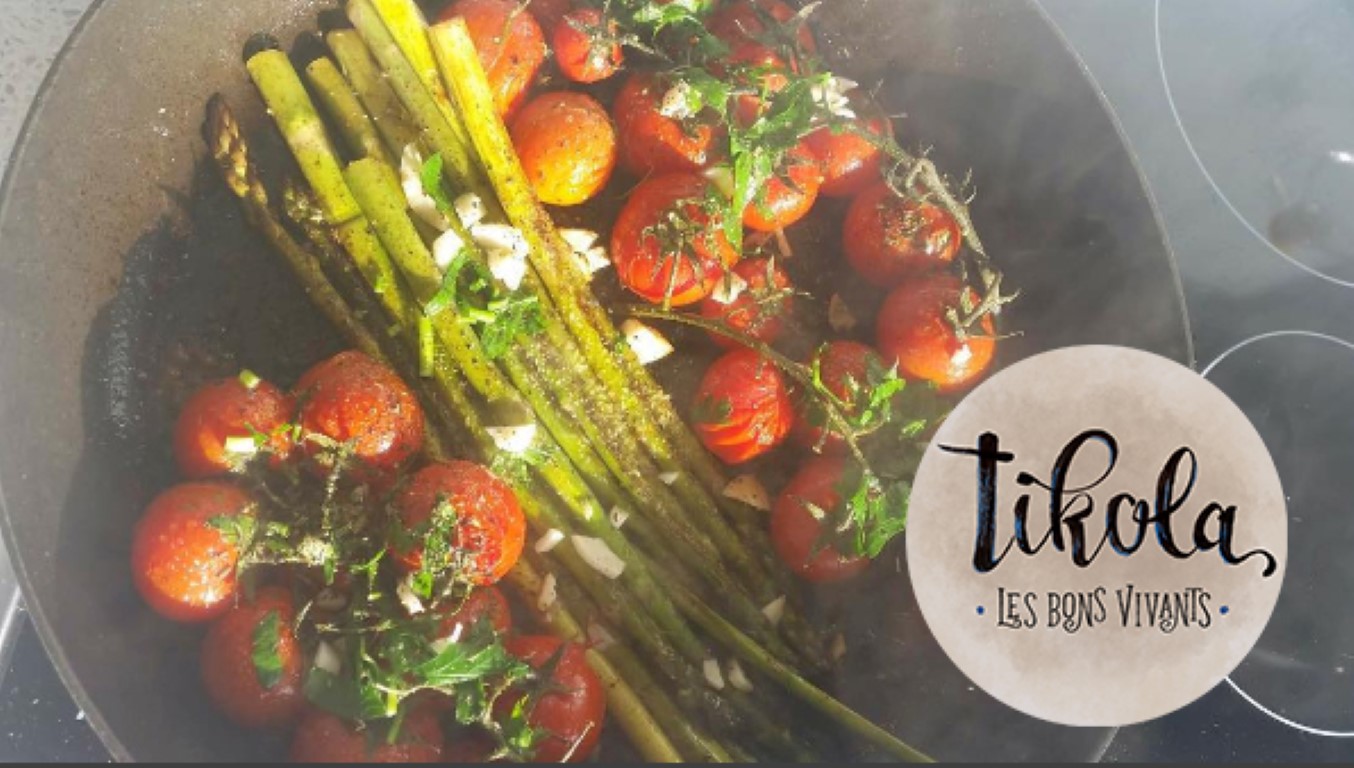
The final logo has a swirly, energetic design with a hand brushed quality. It is accompanied by the tagline with a vintage but quirky feel.
The design is playful and fun, as the owners of the business are. It is at the same time classic and classy enough to make customers think of well made, home-style food.
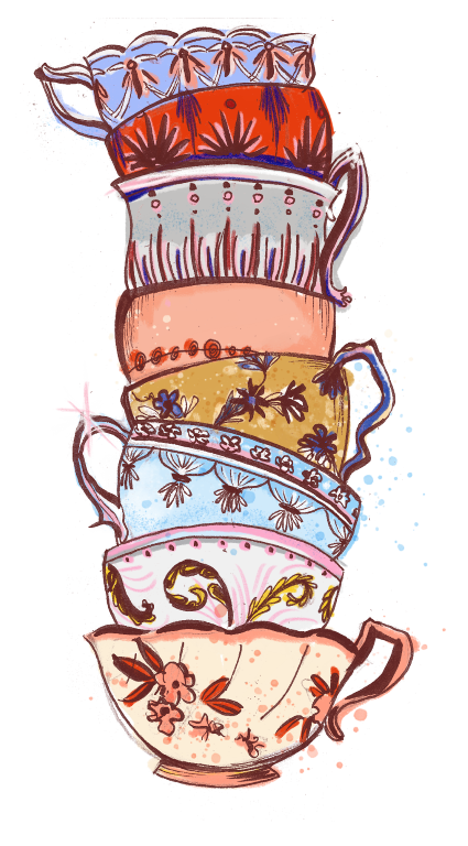
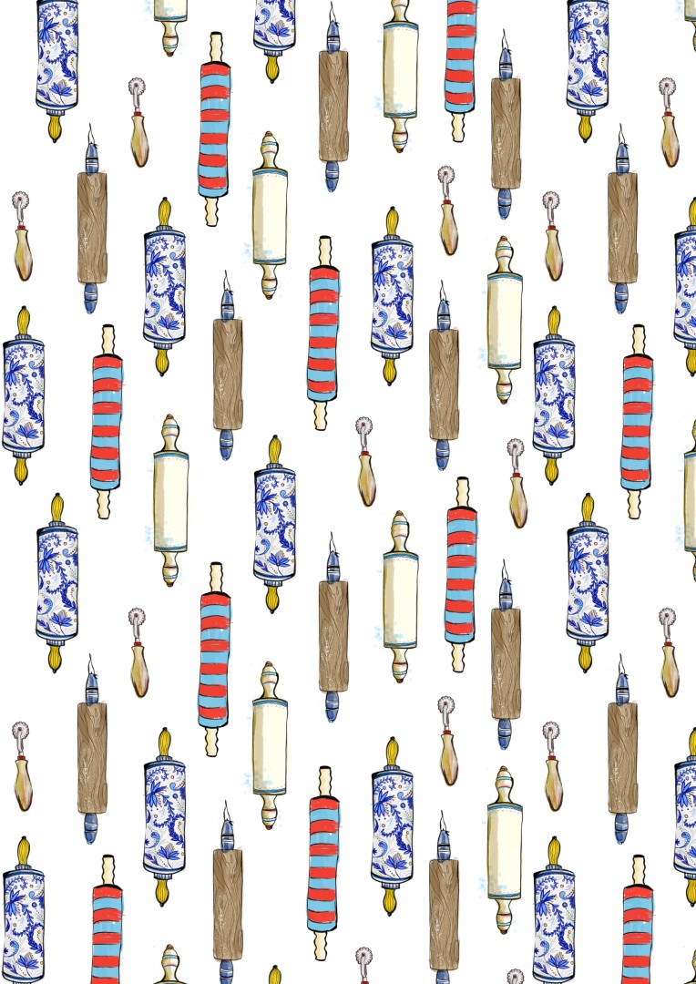
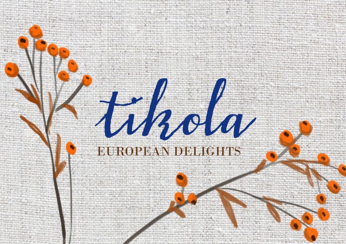
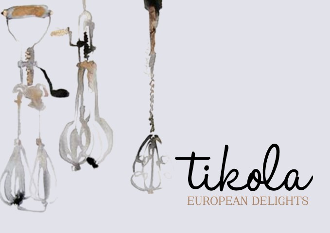
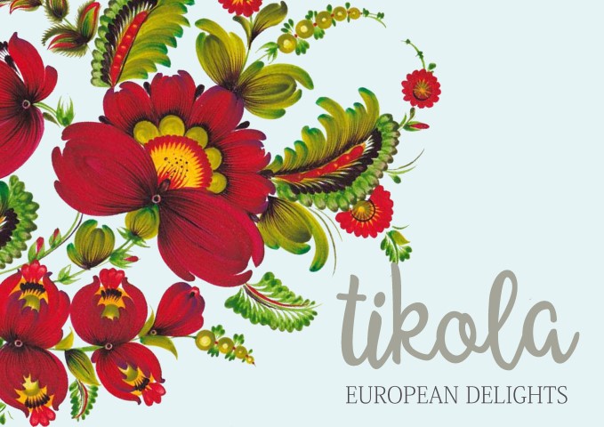
THE ARTWORK ILLUSTRATION
The logo was going to be accompanied by hand drawn illustration that was to help evoke the old-time feel through antique baking and cooking tools. It was also a way to include patterns and colours into the branding without overloading it or taking away from the food itself.
I drew several icons and illustrations to support the logo.
These illustrations were combined to create additional branding visuals. I created posters and patterns which can help with the simple but enticing packaging that TIKOLA wants to use. A bread can be wrapped in a simple paper that has their personal branded pattern design on it.