THE BRIEF
Packaging Design for Waikare Kitchen, a food company producing gourmet spice pastes and sauces, to infuse your cooking with fresh flavours without any hassle. It was important to create a light, playful look to show the purity of ingredients, while still keeping it minimal to stay in line with the modern, clean look.
I created the complete branding, from Logo, to colour and pattern choices, to fonts and packaging design.
THE PROCESS
THE LOGO
The logo is clean and not overloaded with a bit of swing in the typography that is supposed to represent the ease of cooking it wants to promote.
Black and white colouring has a strong contrast but is still pared back which is important as the bold colourful illustration work around and the food photography will have to stand next to it without creating too much distraction.
Previous developments for the logo.
The client preferred something with text only and wider, with a cursive font.
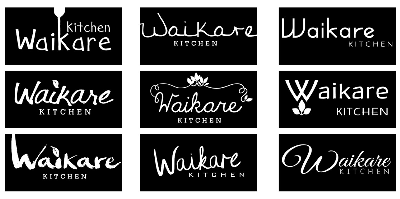
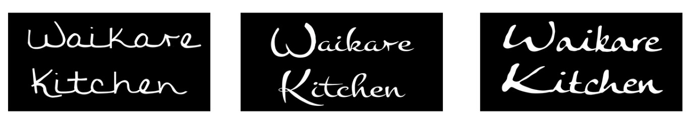
Getting closer to the final version. The logo ended up being custom treated in the capital letters and typeset.
FURTHER BRANDING & PACKAGING DEVELOPMENT
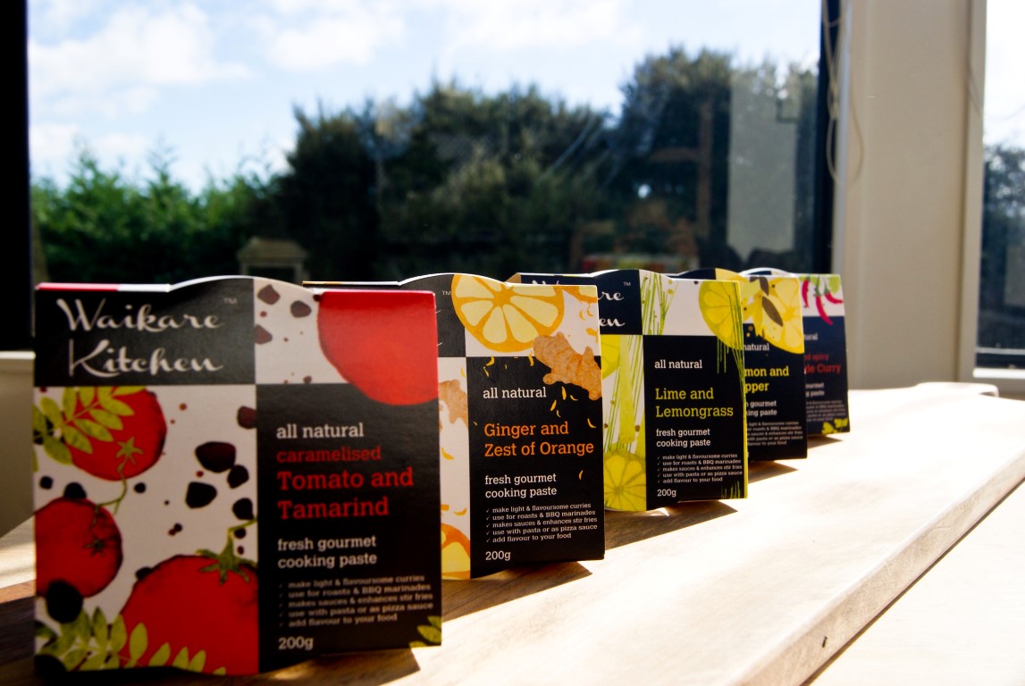
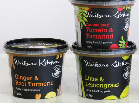
The final branding was a colour scheme oriented on the most common colours for the custom illustrations together with the black background from the logo.
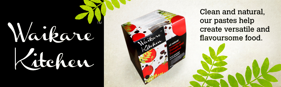
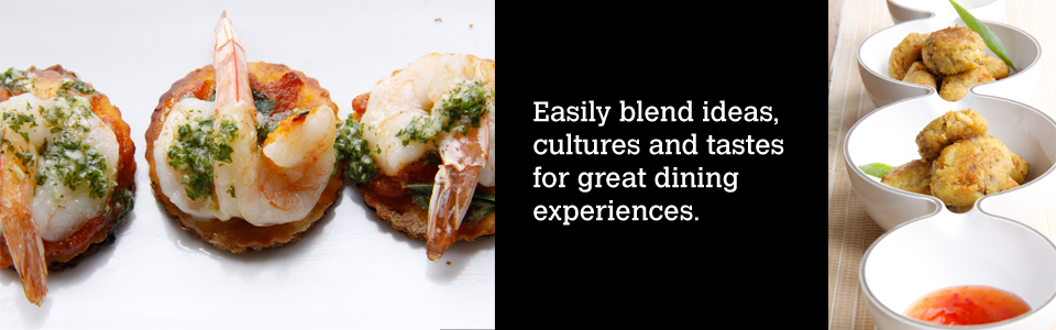
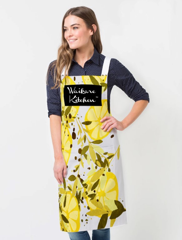
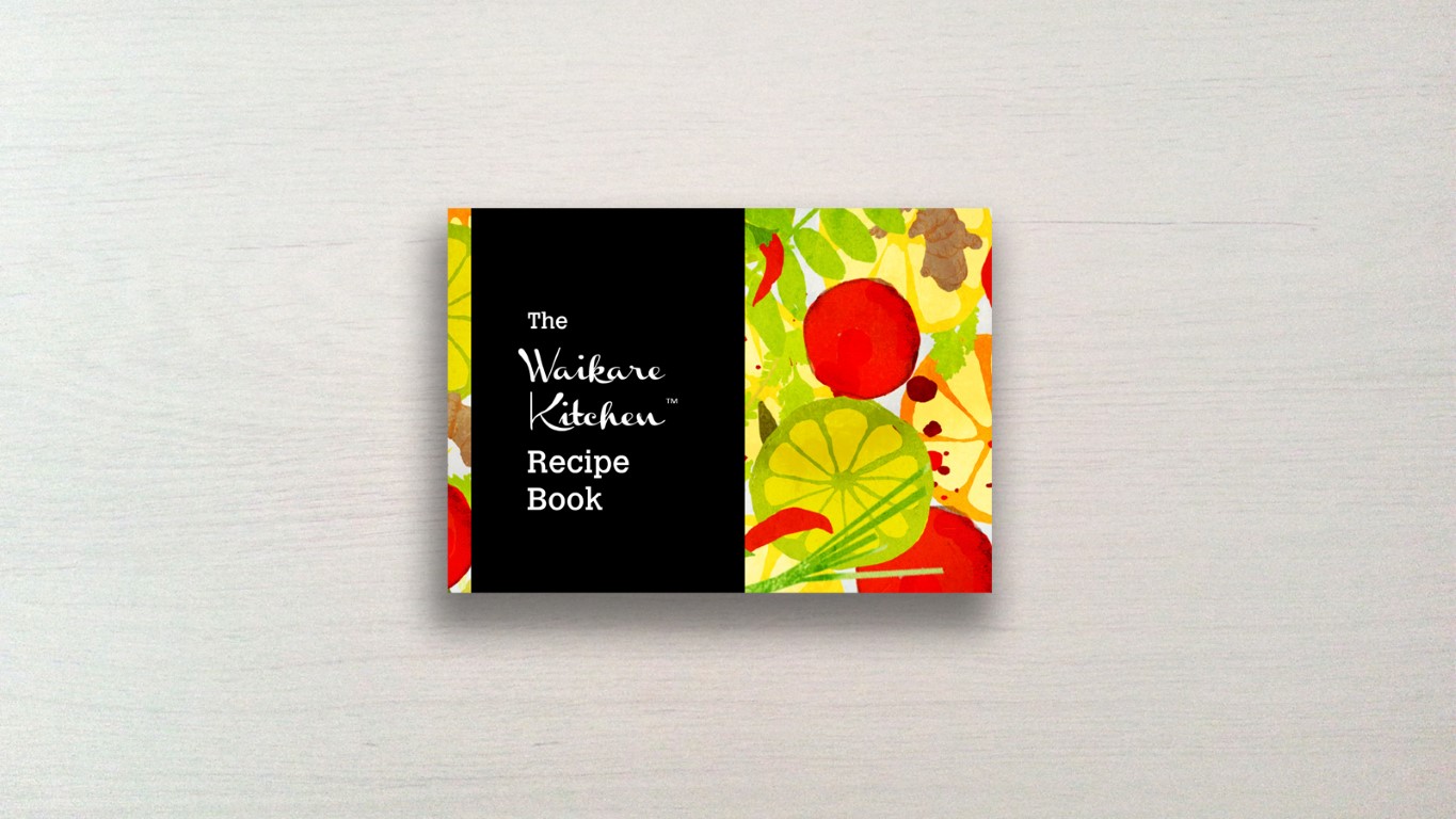
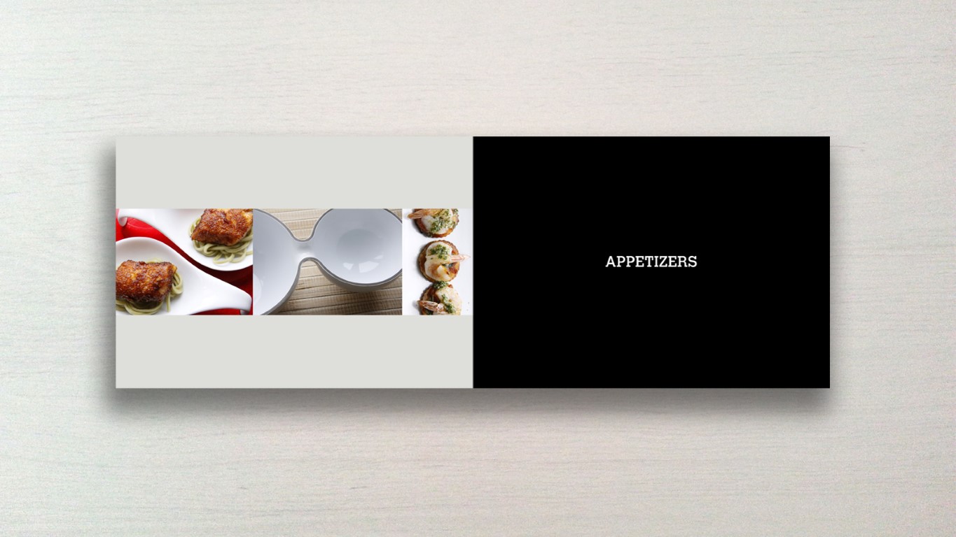
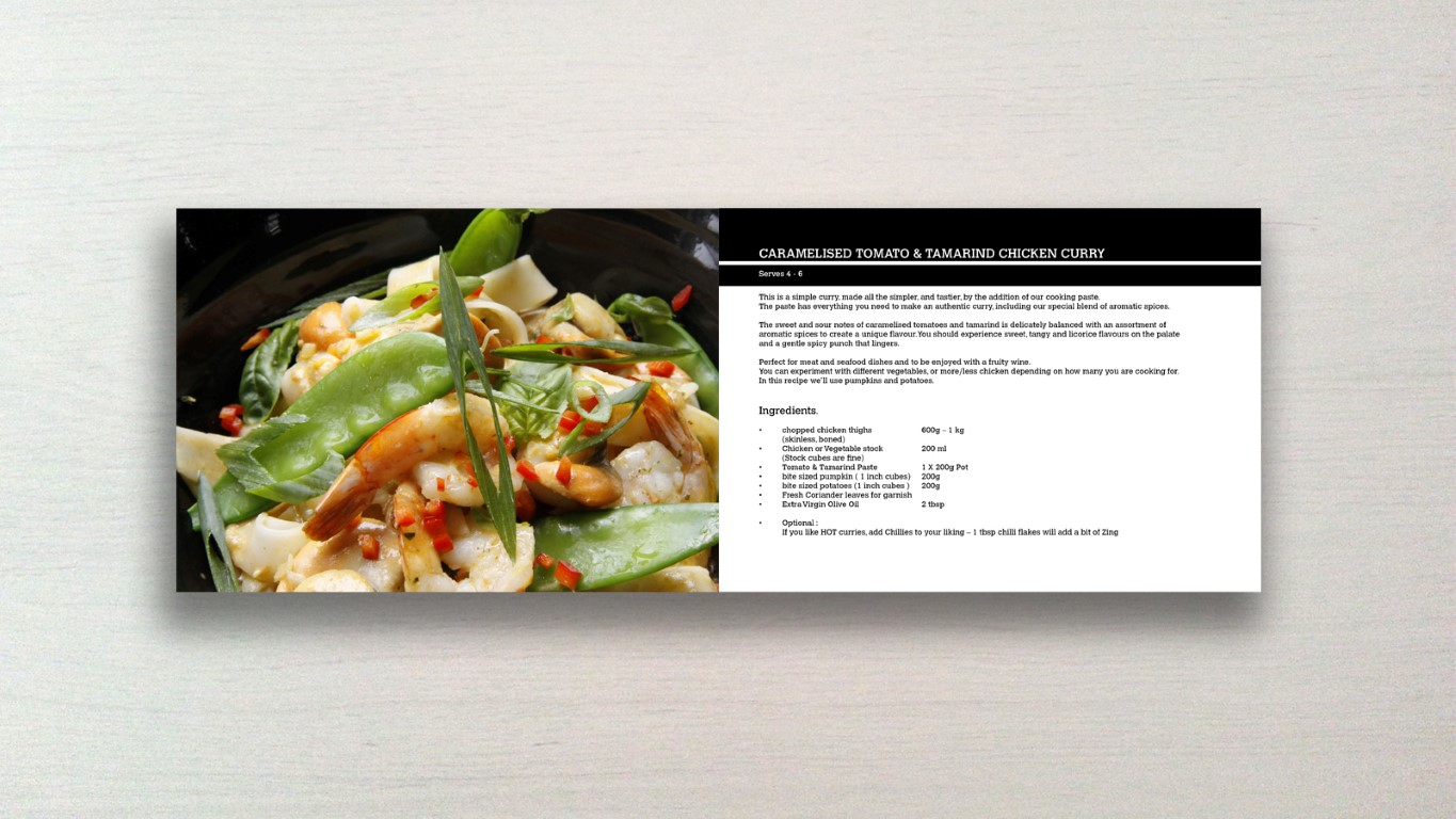
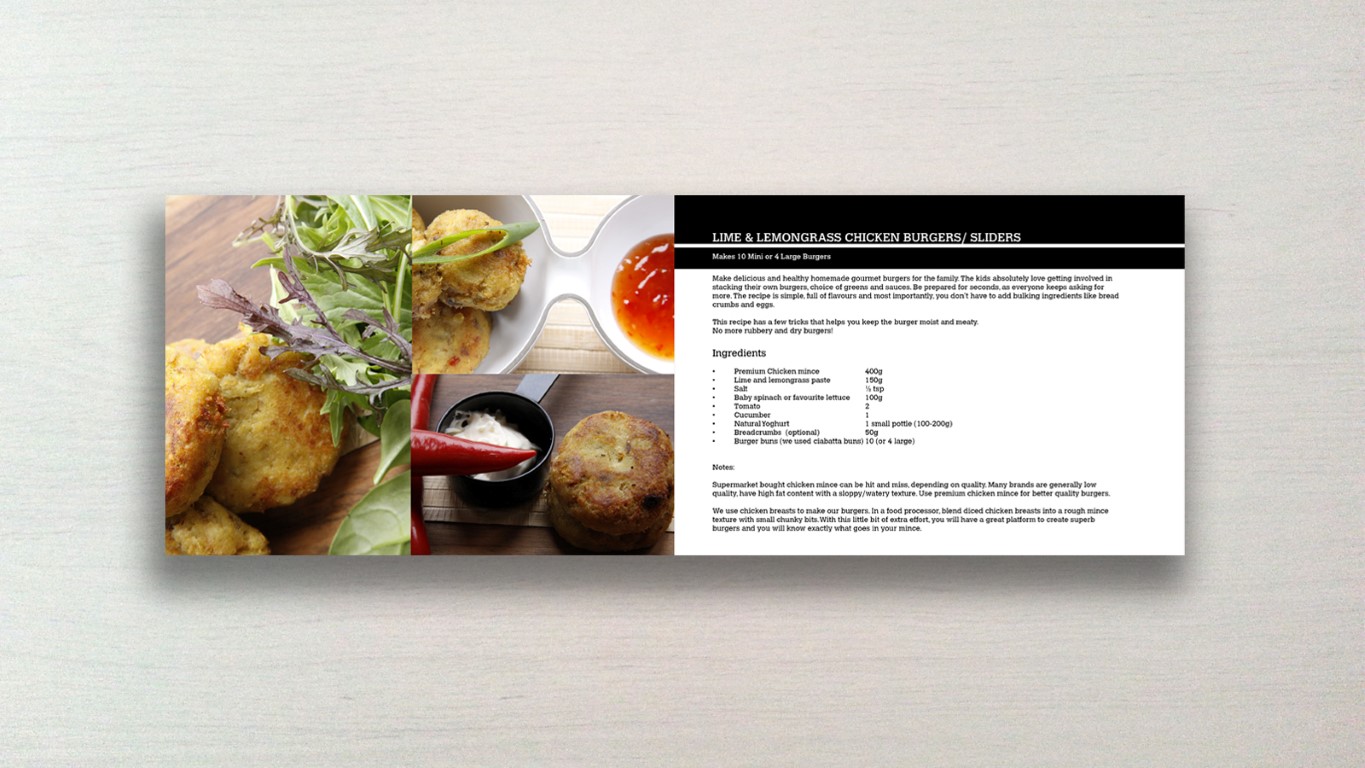
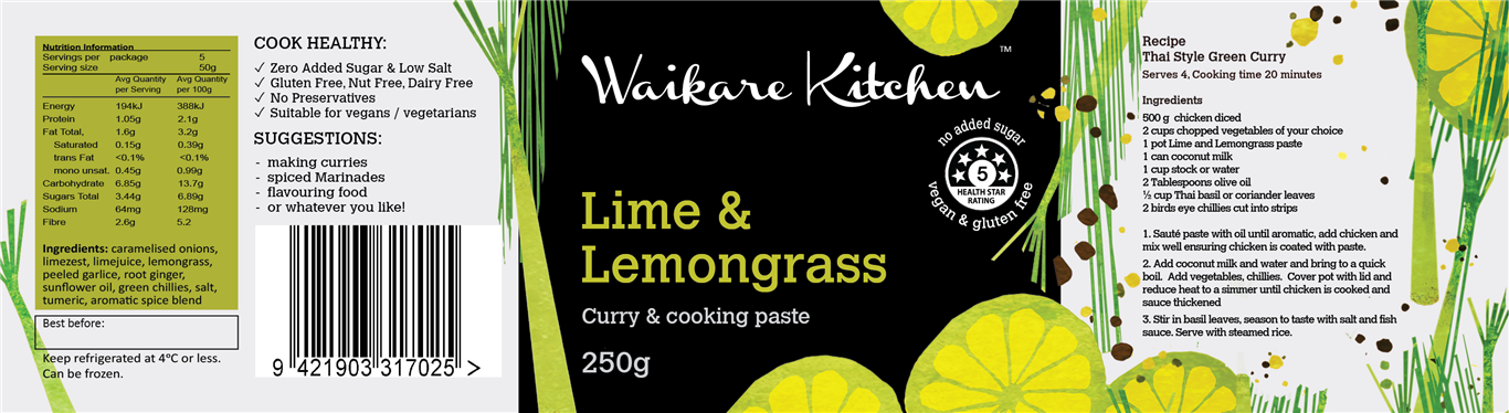
The illustrations are an important part of the branding and can be carried over to additional products, the marketing material and things like a cookbook, etc.
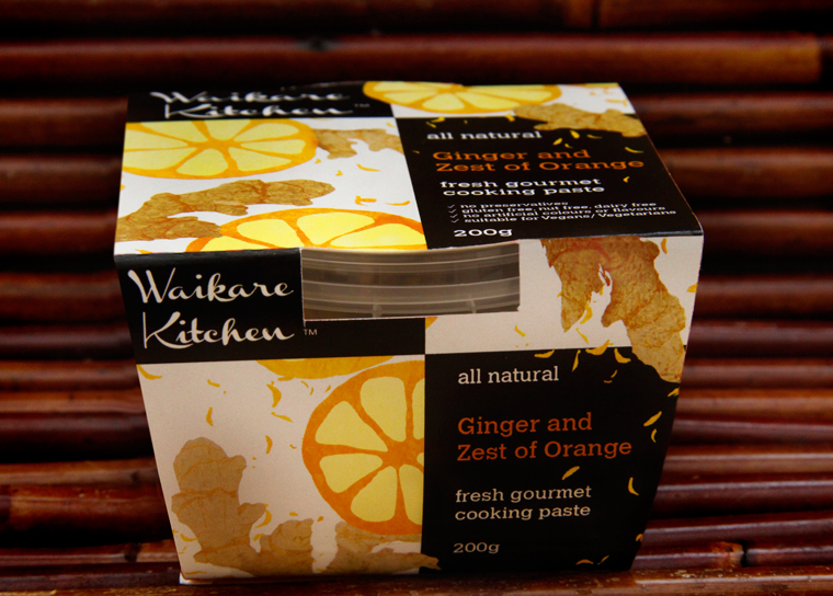
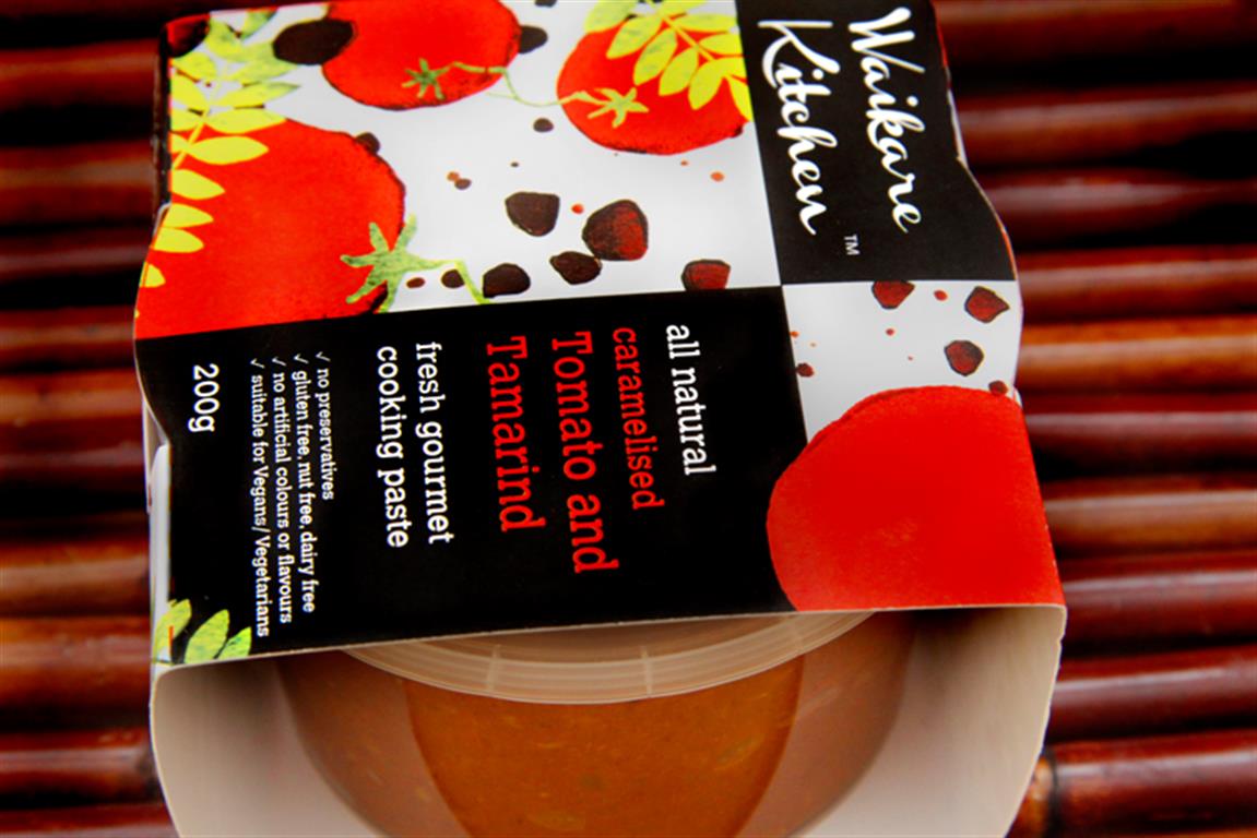
Additionally the layout for the packaging design is visible above. The wrapper went all around the clear tub so that there was an easy, cost effective and recyclable way to package the product.
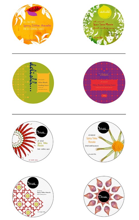
Previous packaging development went through several varied concepts.
The first was a textured silhouette design with handpainted paper, hand written cursive typography and a very warm welcoming feel.
The next one was a more modern indian approach, with patterns at the core of the design, in bright colours.
Another angle was to use fresh ingredients photography, arranged in a partial pattern, that sits on a simple light background.
All versions were scrapped for custom, bright, flat illustration of the ingredients in the sauces.
THE RESULTS
In a short space of time Waikare Kitchen grew intensely from a small local company to a nationwide one that stocks it’s products in deli supermarkets all over New Zealand. The growth can be in part attributed to the attractive packaging design. With the illustration approach it differentiates itself from the rest of the many sauce products on the supermarket shelf and its high contrast colour scheme attracts the eye.
Waikare Kitchen can be found in:
- Moore Wilson’s – Wellington and Porirua Stores
- Commonsense Organics – Wellington City, Kilbirnie, Johnsonville, Lower Hutt and Kapiti Stores
- Ontrays – Petone, Wellington
- New Worlds ( Thorndon, Karori, Khandallah, Island Bay, Miramar & Hastings)
- Farro Fresh Stores Auckland ( Grey Lynn, Lunn Ave – Mt. Wellington, Epsom, Mairangi Bay)
- Harvest Wholefoods & Huckleberry Farms Stores Auckland
- Wise Cicada Newmarket Auckland
- Village Organics – Frankton Hamilton
- Online – for nationwide orders and delivery

PACKAGING DESIGN

UDPATED VERSION
After the first run of packaging for about 1.5 years, the packaging was refreshed to involve less paper to save costs and space. The design was changed to a tub only with shrink fit printing all around and a sticker on the lid.


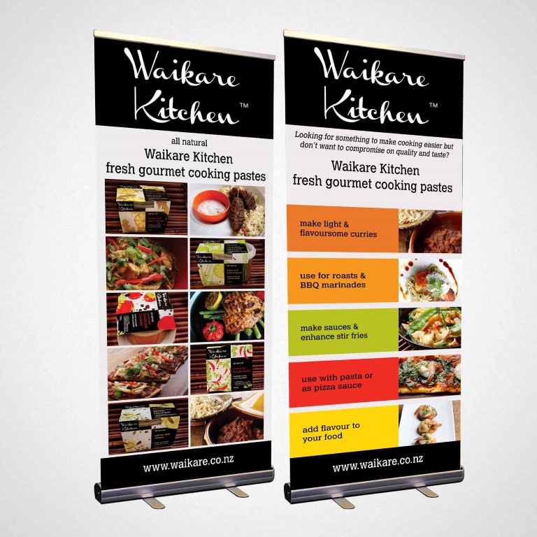
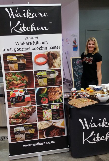
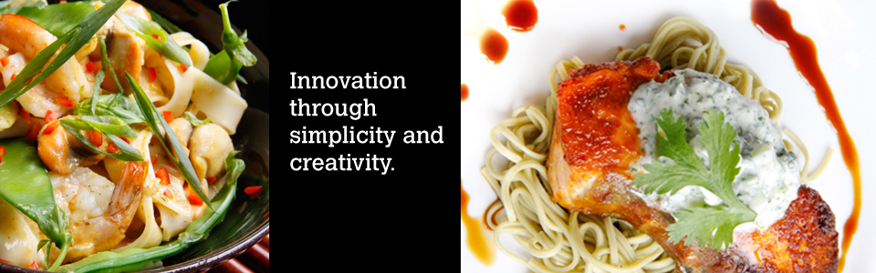
ADDITIONAL BRANDING & MARKETING MATERIAL