THE BRIEF
Rockaby River is a baby play mat company from Queensland who approached me to create their mat designs with a distinct boho/ Australiana vibe.
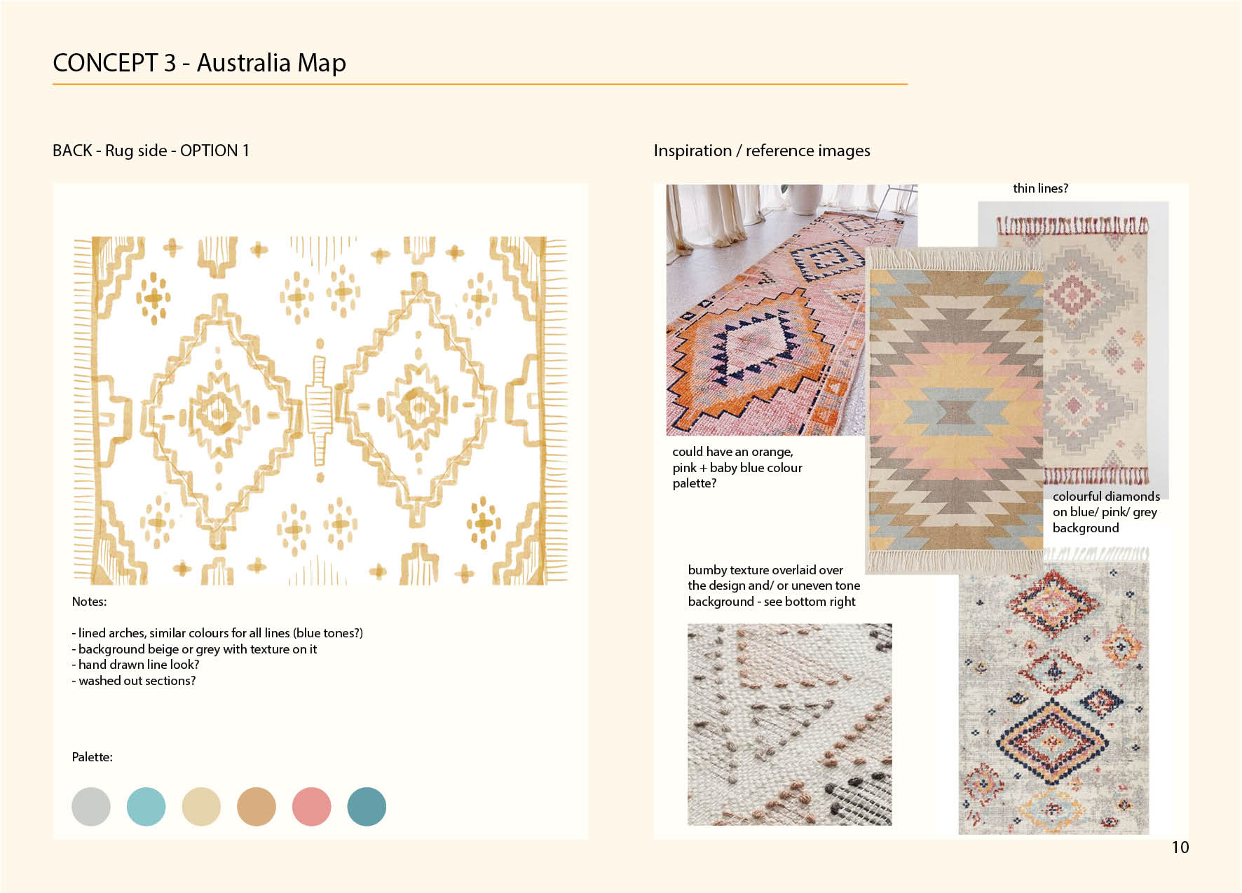
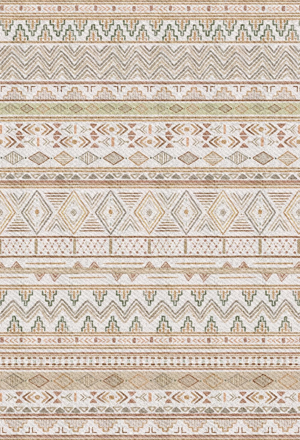
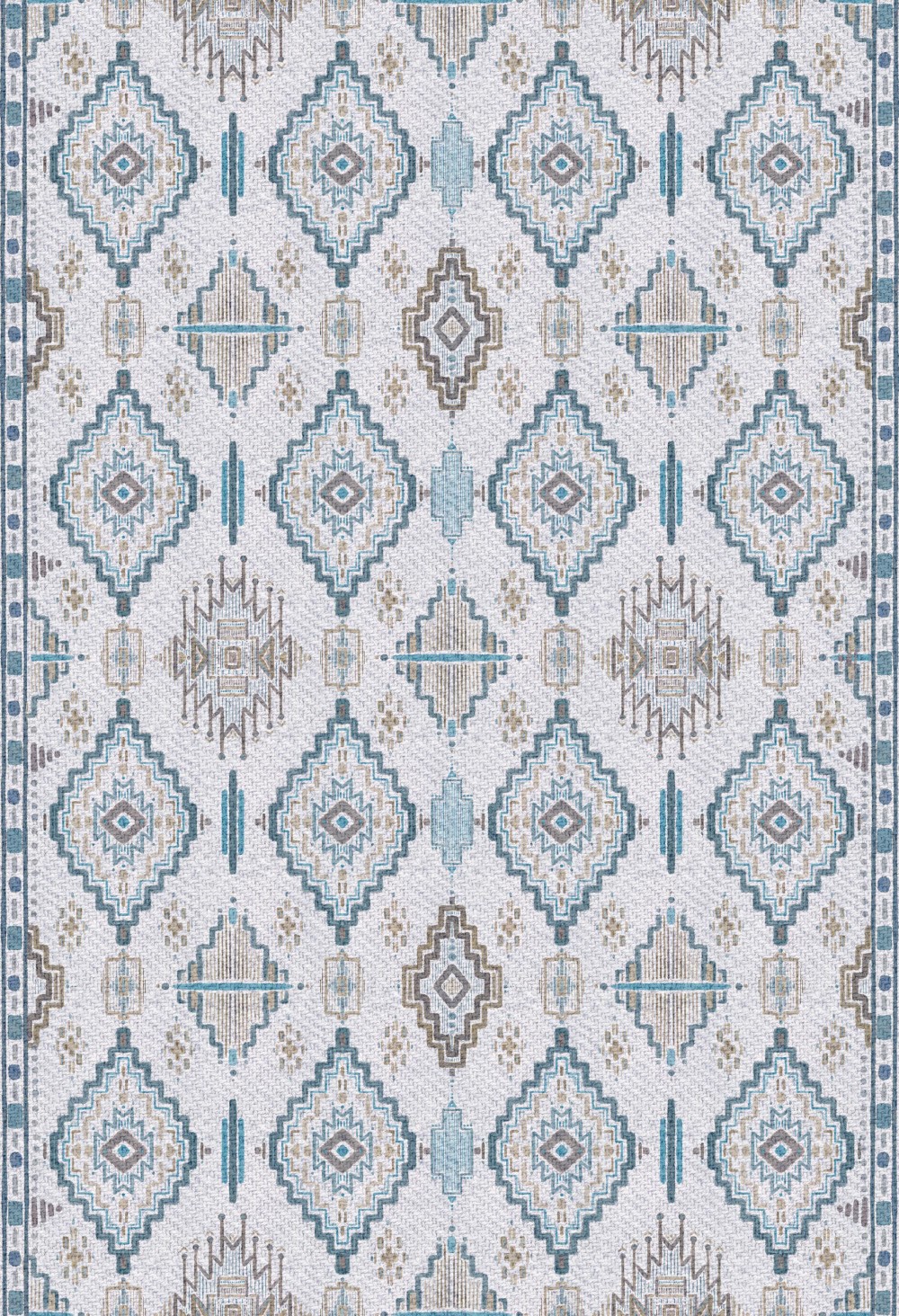
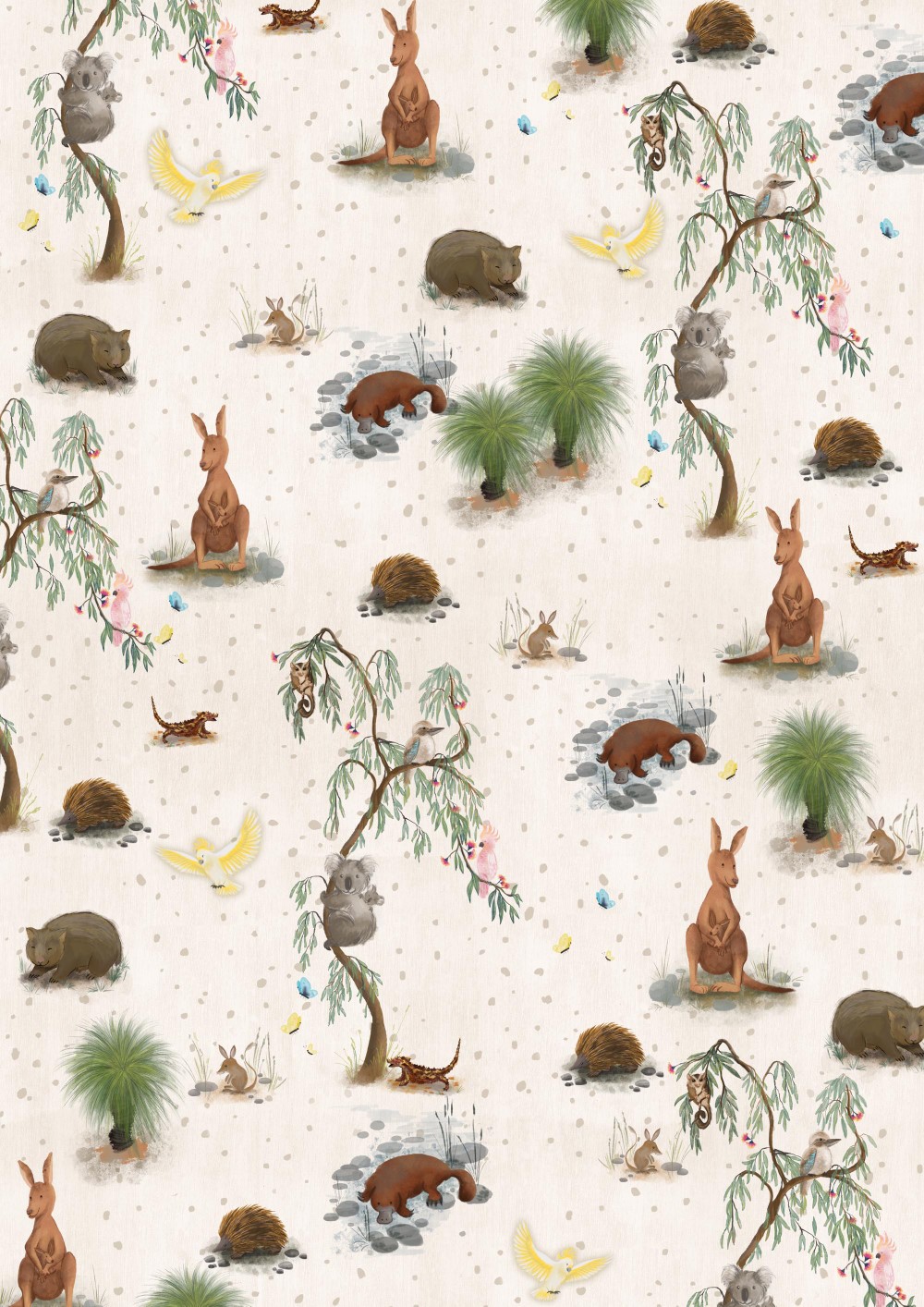
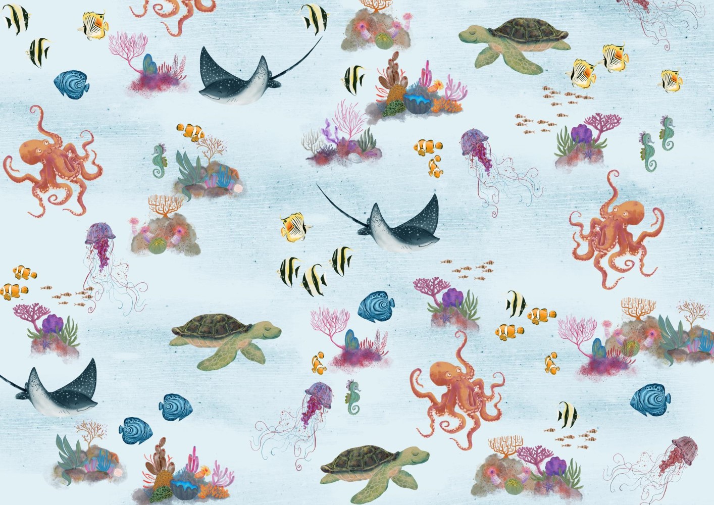
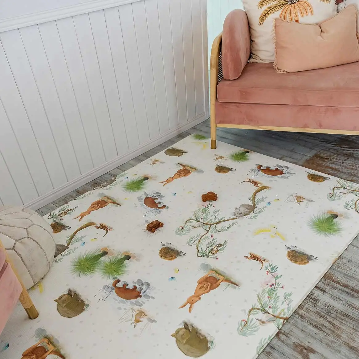
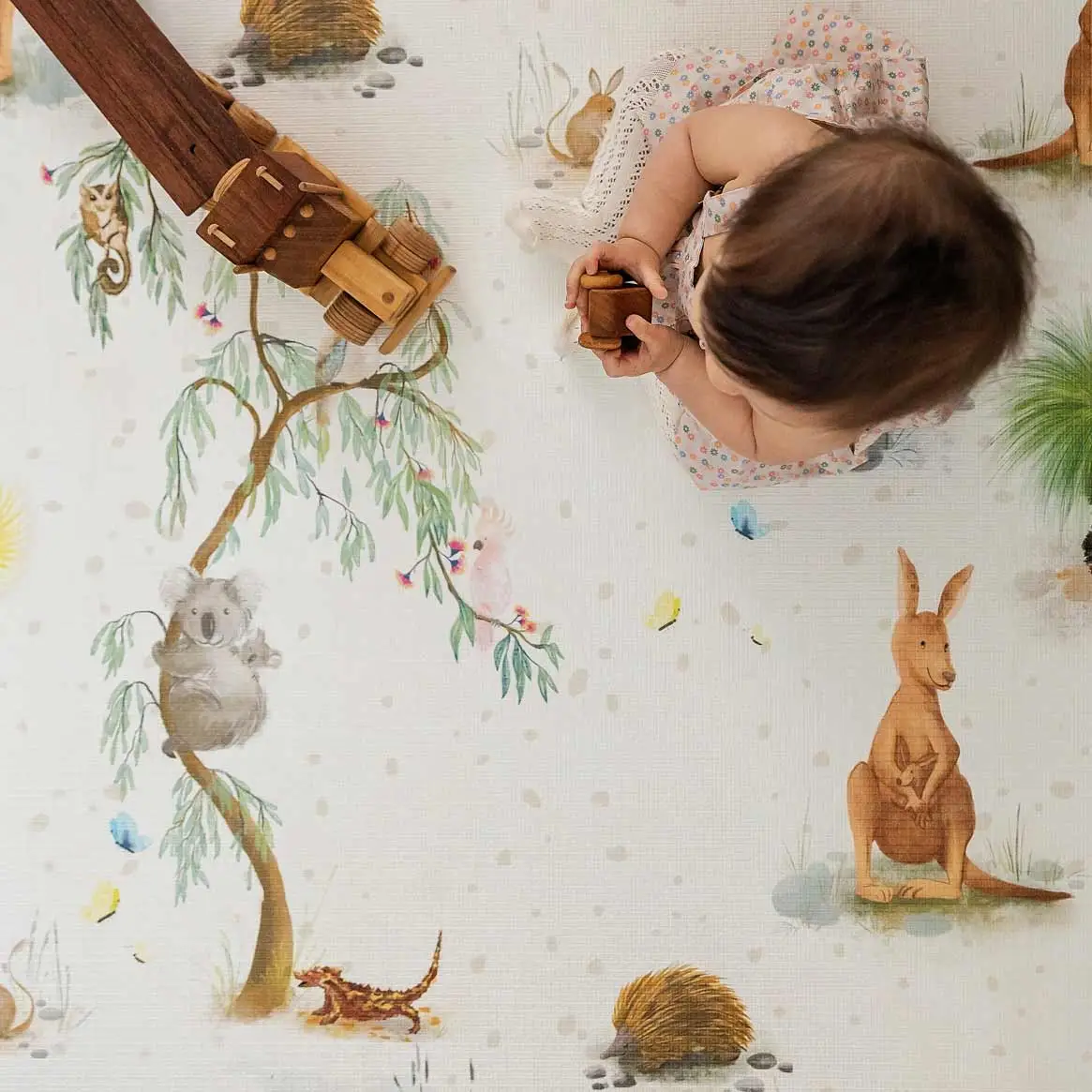
We came up with the several concepts, all with a bohemian rug design on the back and some fun animal and landscape designs on the front. This way, the user can turn the mat over to make it “adult friendly” when the kids have left the room and easily transform the space back to a nicer interior without having to put the mats away. The artwork style showing all the animals and features was to be soft, lighthearted and detailed animals, all set in a simple repeat pattern for easier production.
Colour palette of the designs was chosen to accommodate this, with pastel shades and a colour combination that is easy on the eyes while still exciting little kids.
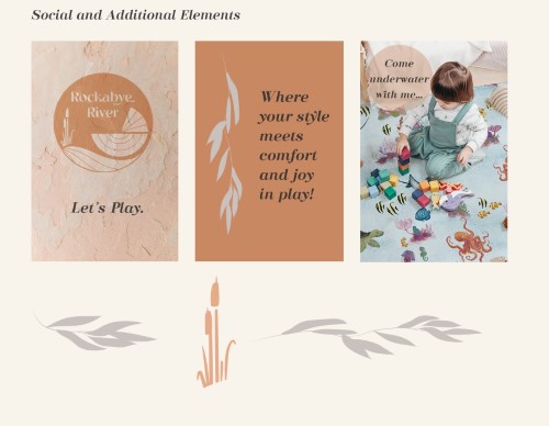
Additionally, the complete branding was assigned to me as well, with the logo to evoke the same vibe as above. This included a logo development, designing the packaging of the box and a branding kit for the website and socials.
THE PROCESS
For the mats, I did a lot of research and idea creation for a variety of concepts, all to help bring fun and a relaxed atmosphere to the mats.
Sketches and references were used to illustrate these concepts to the client so it was clear how the final result could look.
Due to production constraints, placement designs had to make way for repeat pattern, which allows for slight variation of the pattern without creating flawed mats as the pattern would continue if not printed exactly the same on front and back.
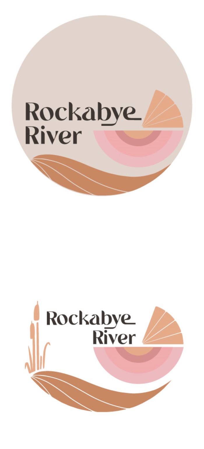
For the logo, we started off by exploring concepts around the images of “rockabye” and “river” by drawing a crib and various abstract ideas around “river”. These concepts had a more painterly vibe to express a bohemian feel, which was light and fun but not quite distinctive enough.
After some more experimentation I chose to redirect to a more 70s colour palette and style which led on the right track.
The bassinet from the start was a winner so it was reincorporated back into the logo, but now transformed into a more graphic and minimal design.
Once this was complete, the final design only needed some text adjustments.
THE RESULTS
THE ARTWORK ILLUSTRATION
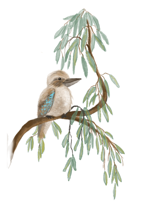
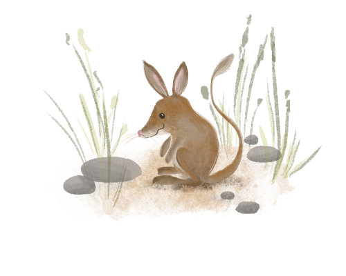
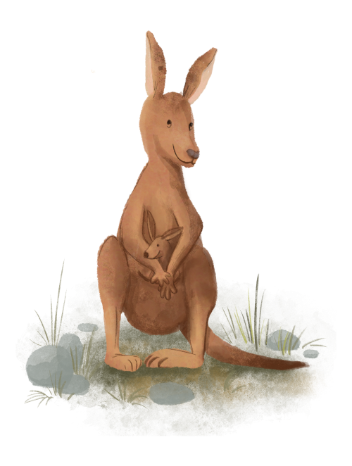
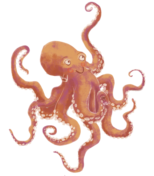
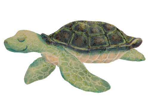
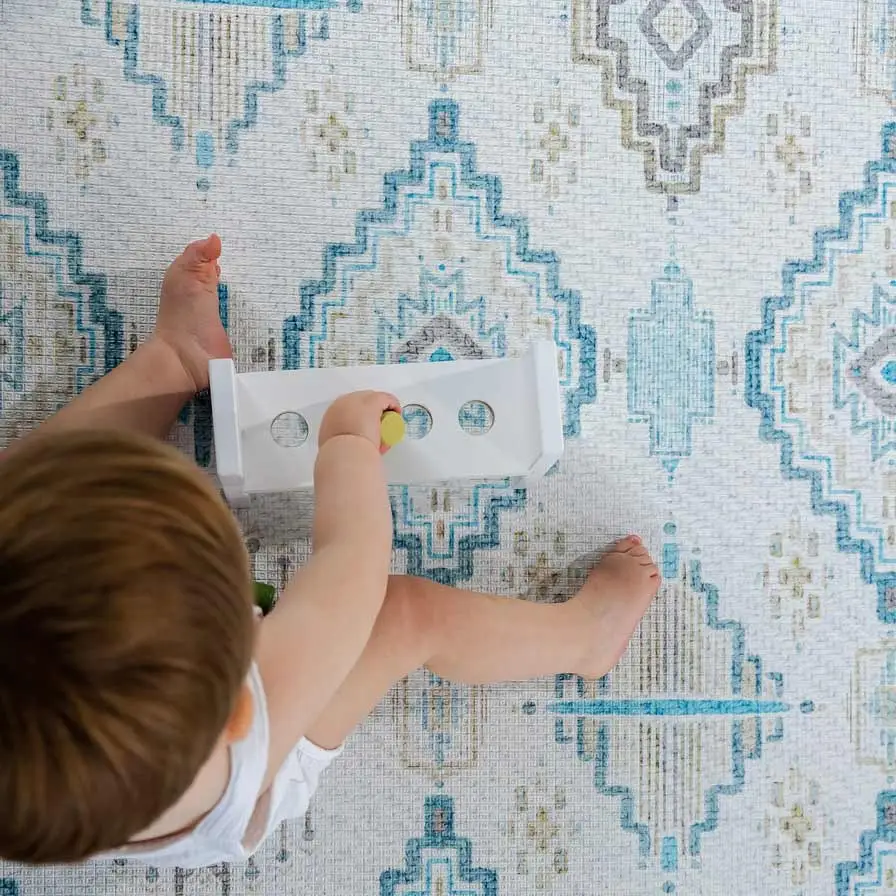
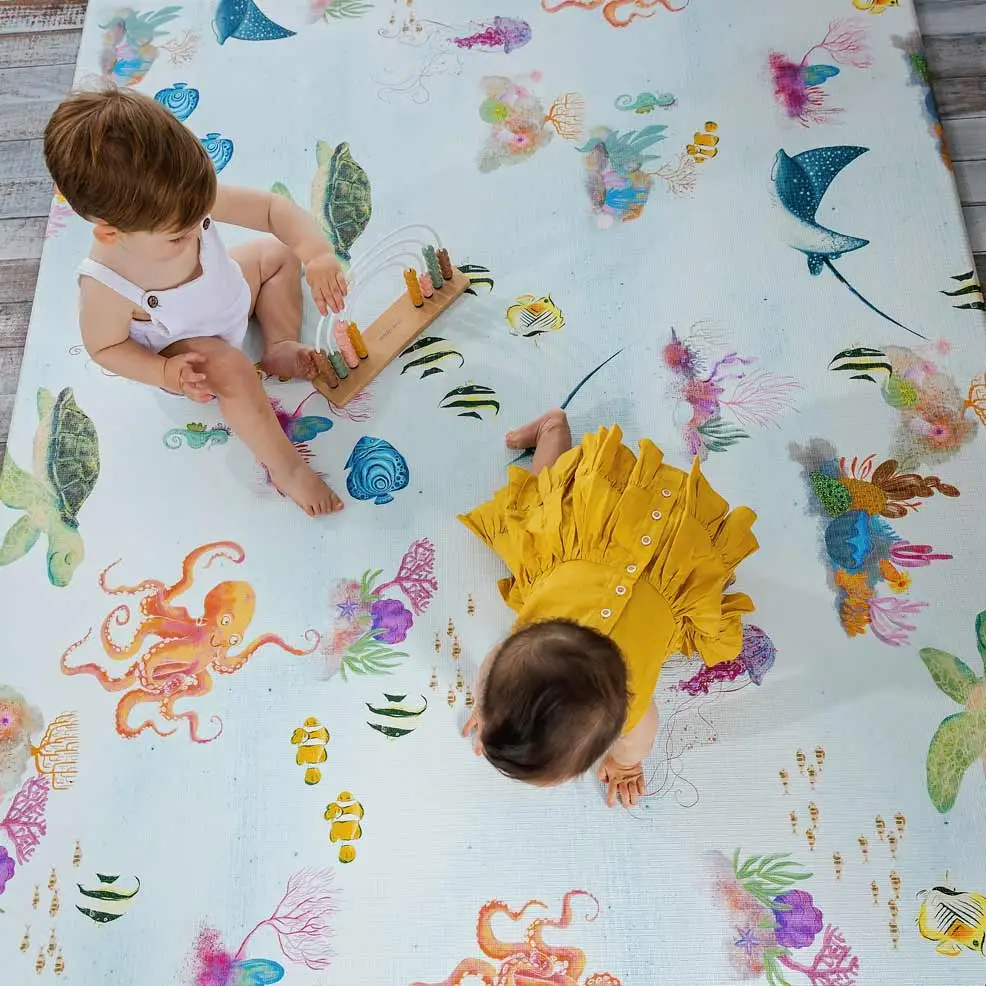
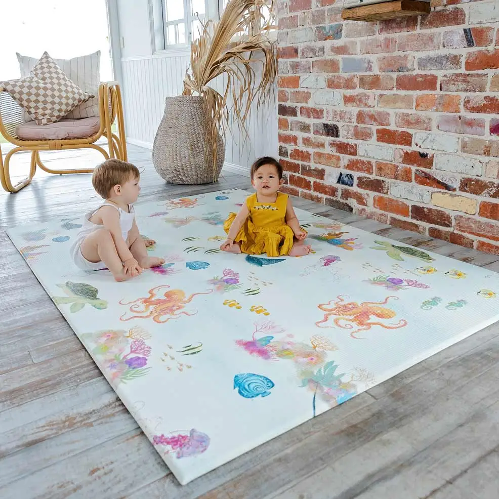
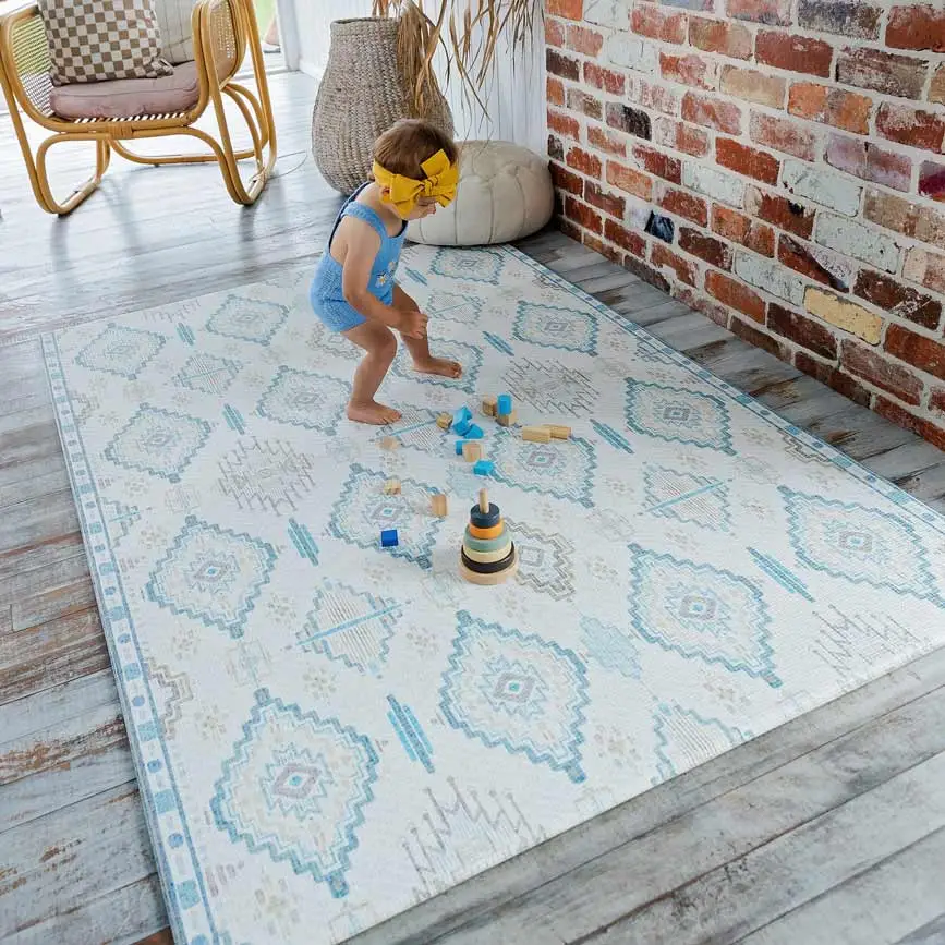
The final 2 mat designs were themed around land and water animals of Australia and back sides that remind of Turkish rugs but differ quite a bit from each other with a linear pattern in earth tones (to match the land animals) and a diamond pattern in blue ( for the water animals).
Care was taken to draw each animal to match and compliment the others in style and colour.
These animals can now also be used separately for other design collateral and marketing purposes.
THE LOGO
The final logo was a great culmination of the elements that reflect the brand: 70s bohemian cool, soft colours with a touch of whimsy with the font and river reeds and a nod to the child market with the bassinet.
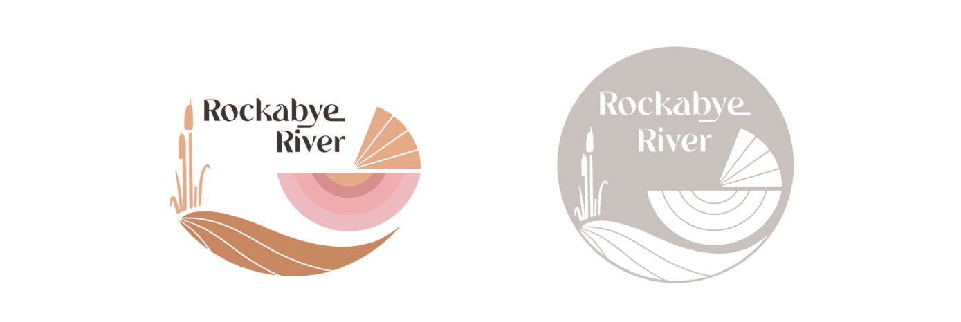
It also worked well for variations as a stamp or b/w version and a no background option.
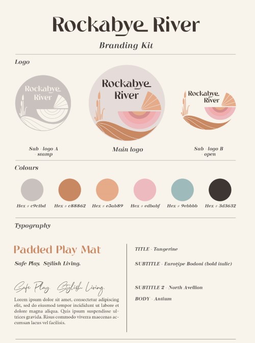
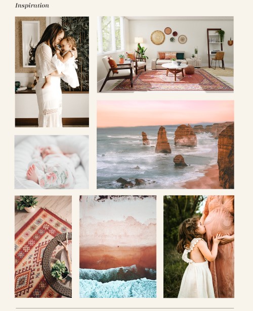
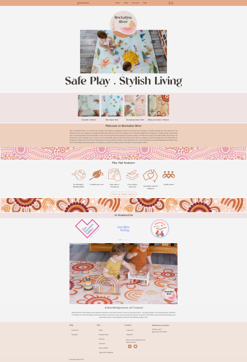
The branding kit included a set of colours, fonts and inspiration images to use for the website and social media. The actual website is shown on the right and it shows that a lot of the recommendations were implemented and compliment the designs.
