THE BRIEF
Tricia Sharkey is a colour expert and coach. Through colour, and your preferences / dislikes to certain shades she helps her clients empower themselves to discover and embrace their inner being and to find answers and clarity for their life. To teach her knowledge beyond 1-1 sessions, she has created a fun and light book about colour and what to expect in life from each different shade in the rainbow…

This book needed a cover, but also a full page illustrative sketch for each shade discussed in the book.
For the cover, Tricia was keen to have the book show up boldly with colour on the front, represent her as a person through a portrait and a fun way to incorporate all the colours she loves so dearly.
The interior of this book was also to be designed throughout by me so it creates a harmonious experience from beginning to end. Each colour section has a description, some positives and negatives and a set of mantra sentences for working with the particular colour in a positive way.
THE PROCESS
THE COVER
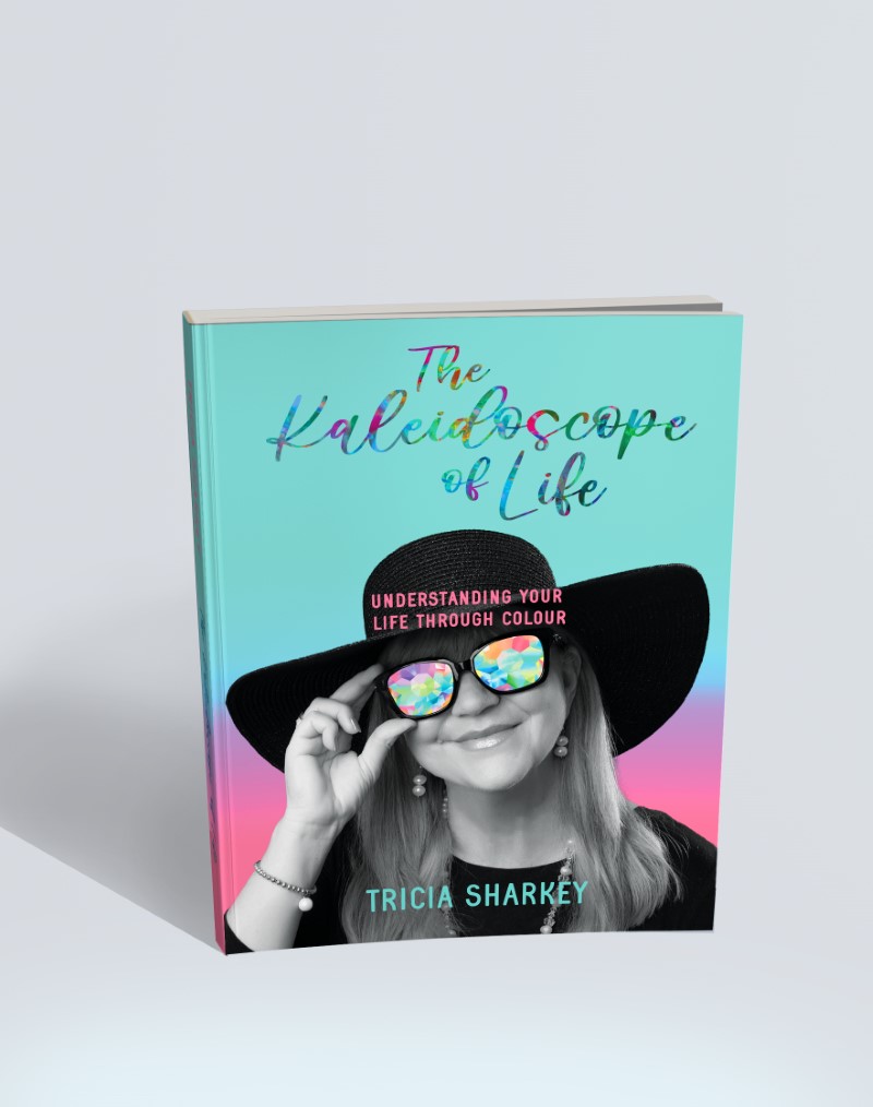
I started with the cover, and Tricia was kind enough to supply some good photos of herself for use. After some concepts showing different ways on how to combine the colours with the photo, we settled on replacing the glass of her sunglasses with a kaleidoscope of colour, I quirky way to reflect the title of the book and an easy solution to add the colours in without overwhelming the photo or title.
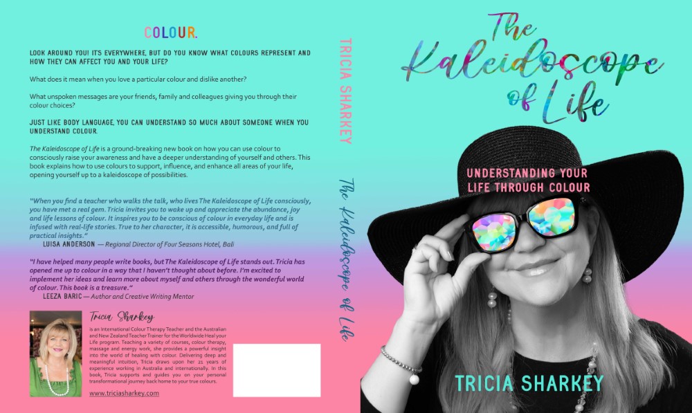

We decided to turn the portrait into a b/w photo, to streamline things and go too wild. This left room for the title to include more colour and a font style that spoke to Tricia.

THE BOOK INTERIOR
For the interior, I created quick sketches for each colour option which then were turned into a clean black line art drawing and brushstrokes of colour underneath.

THE RESULTS
Tricia’s book is bursting of colour and the cover reflects that. It uses a lot of elements that were important to her: her likeness, her favourite colour turquoise and the full spectrum of colours and title incorporated in a playful way. Combining all these elements without making the cover become too much of everything was the challenge to overcome for this cover. I believe it has been achieved by focusing on what is important design hierarchy-wise and standing by the client’s personality in a way that enhances all elements to a successful combination, not cancel them out against each other.
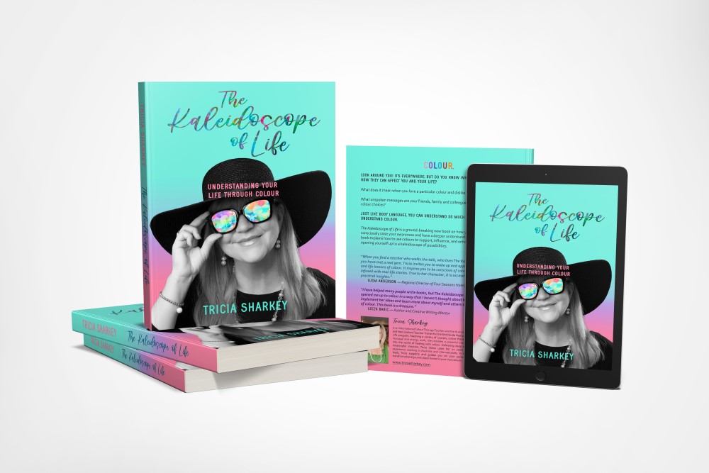

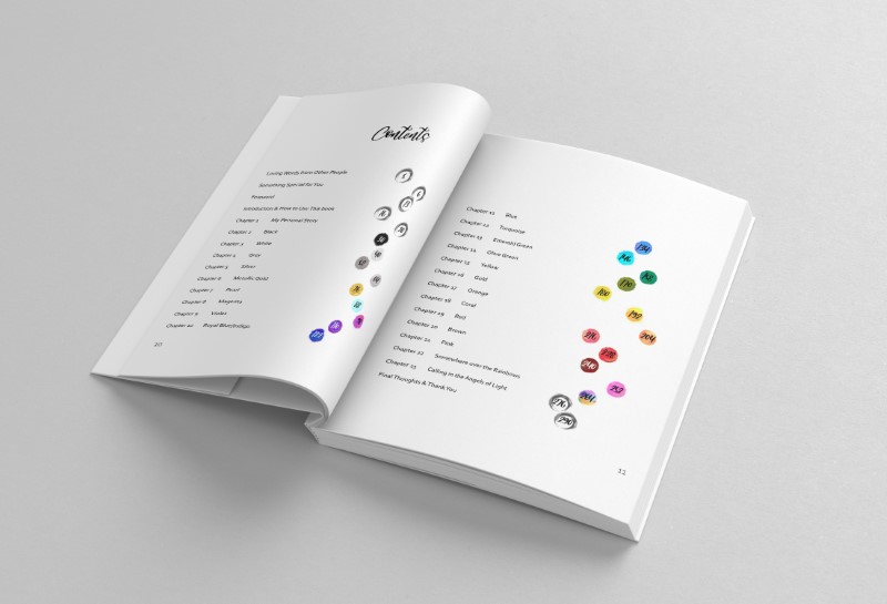
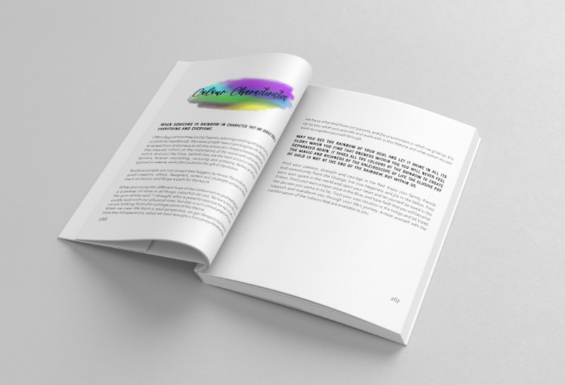
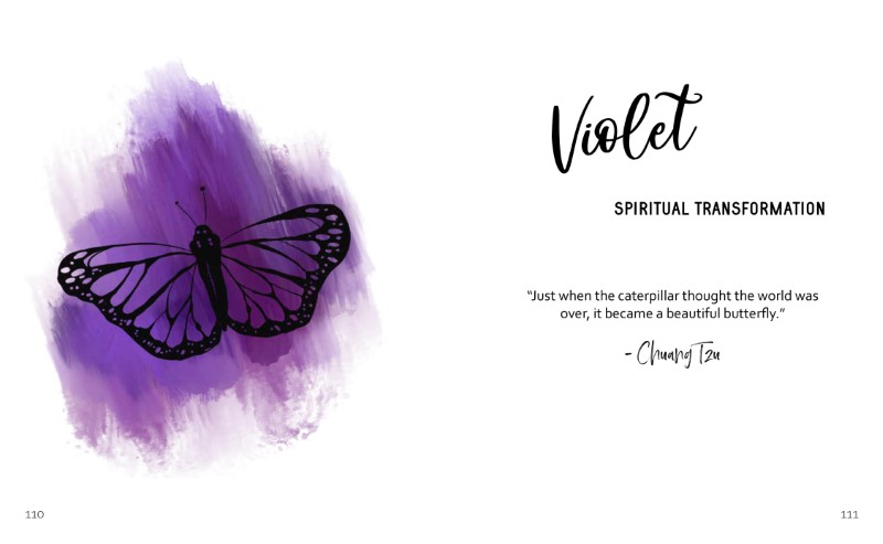
The interior reflects the outside of the book with similar fonts, style and layout. Again focusing on clarity and repetition to not overwhelm the reader was important.
There is a lot of colour throughout but there is a lot of white space to even this out and gives the eye places to rest.
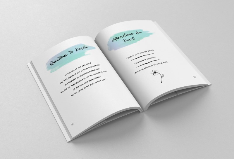
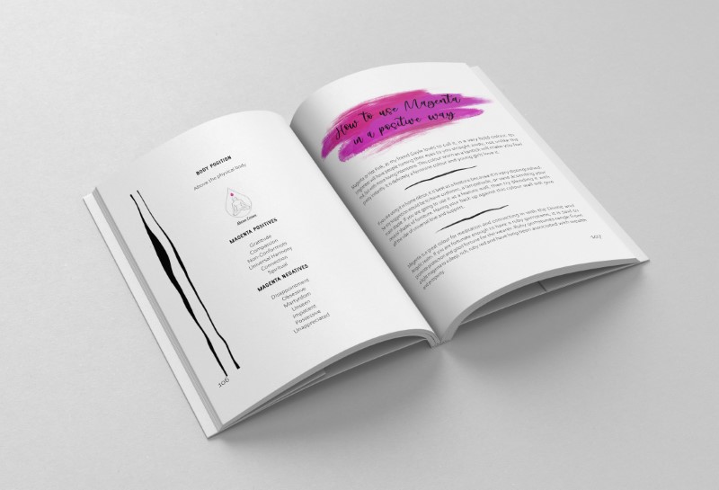
Additional decorative element were added for layout purposes, like lines and shapes. The important thing was to represent the same style throughout the book, so the uneven strokes match the illustrations.
