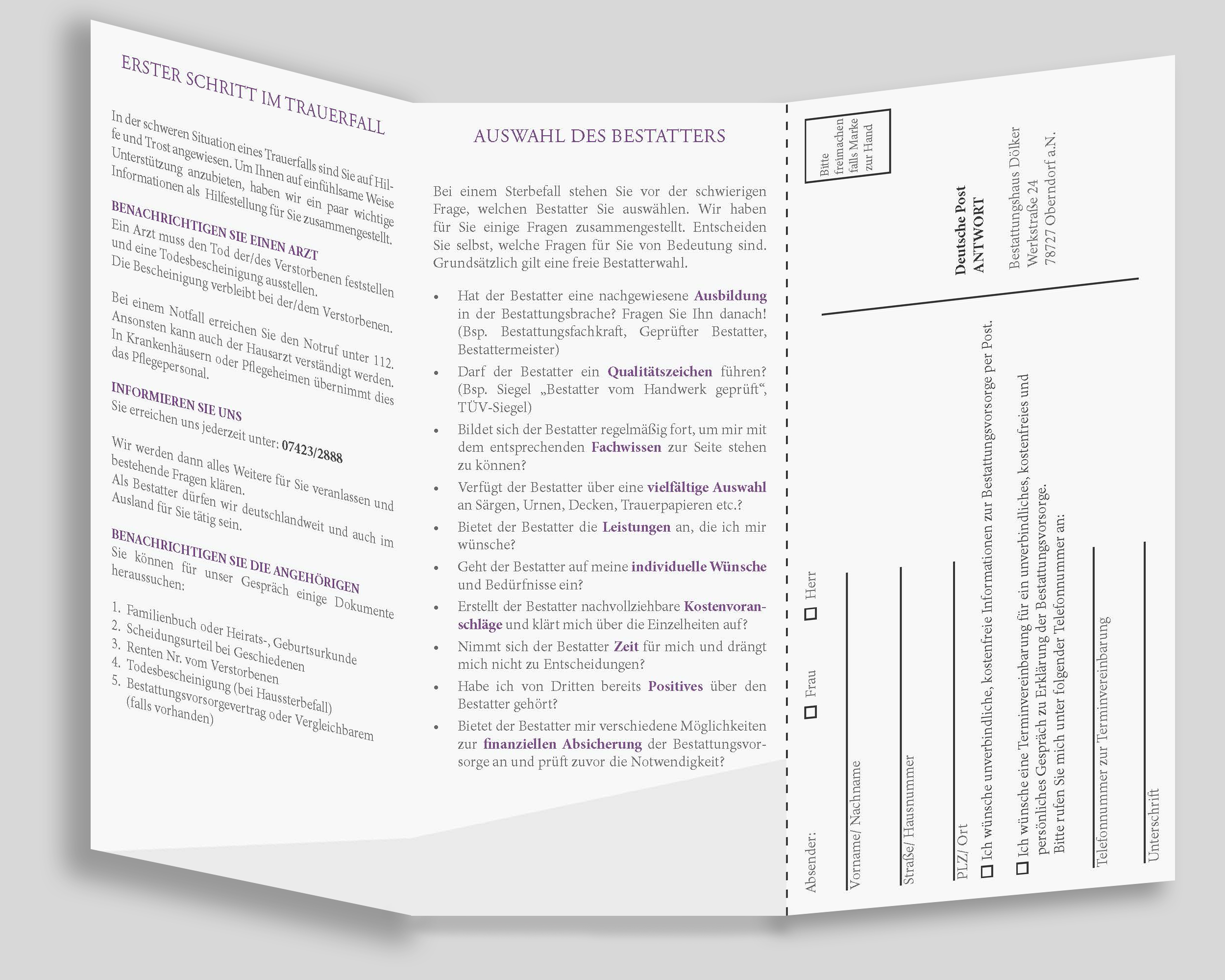
Above is a smaller design job I did lately – a 3 page roll fold flyer of simple design, tying into the high end brochure of the Bestattungshaus Doelker with ease by using the same design features that the “big brother” has, but keeping it more low profile.
Flyers are quick and simple to design if there is an existing style guide (i.e. more indepth brochure or website) already in place. This way the business can keep costs low for the design as well. This example was created in 3 hours.
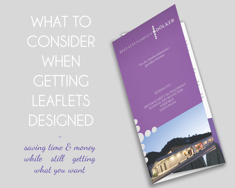
Here some tips if you are thinking of getting a flyer made and want the job to finish quickly and without hiccups:
Have your content and text printready.
– That means pictures all in correct colour profile already, high res and no unsightly backgrounds etc to photoshop. If your flyer consists of products, have a clean white background without distractions.
– Your text should be final. Then the designer knows how much text to work with, can arrange it correctly right from the start and doesn’t have to make adjustments later that might seem small but can cost time if they move the whole design around.
– Also, proofread your text, because designers are not editors. They will not check your text for errors, but if you find some later, it will be the designer who has to edit the corrections in the file, which you will have to pay for.
Keep it simple
– Firstly, the cost of your flyer is not only the design, it is also printing. That means, sticking to tried and true layout and folding choices will keep it simple for the printer and the designer, hence speeding up the process. You can still add “extras” or embellishments, like a die cut (special cut out shape) or enhancement of words like embossing or gold foil printing later if you have some spare in the budget and feel you need a bit more oomph. But keeping it simple at the start can help avoiding costs to spiral out of control.
– Secondly, a simple design with not too much going on (at least on the cover), can have a stronger impact, especially if it has to compete with very similar looking designs on a busy rack. You can stand out by drawing the eye to a design that is clean and calm – a rest for eyes that had to look at crazy designs all over already. Or just be different. Evoke curiosity by just having your company name and a pattern on the front for example, people will want to know what your business is all about and actually pull out the flyer and open it up.
Know yourself and what you stand for
– For this point the ideal is to have a “style guide” or clear cut branding already. The designer will take all the colours, fonts, images, patterns, etc that already exist as part of your branding and tie it into the flyer design. This will make the job easy and quick to assemble. And in the end you will have a design that will get recognized by customers who will see or have seen your other branding.
– If you don’t have anything much to go on (yet), the best you can do is give your designer a clear idea of what your brand is all about. Who/ what type of people buy from you, which imagery speaks to you or do you think represents you well, what words/ colours do you associate your brand with. Let your designer know (a tip: a vision board or pinterest board can really help here!) and then trust them to come up with something great for you. They will get a clear idea of who you are if you informed them well and then take their skills to take these ideas to the next level.
So these are the main things that work wonders to get a design that represents you in the best light possible, is finished fast, keeps cost managable and that you like!
Til next time
Ina