I have recently done an illustration job for the church community back home in Germany who wanted to update the look of their community letter. It hadn’t changed since the 80’s and I saw a real opportunity to give it a fresh, positive new look!
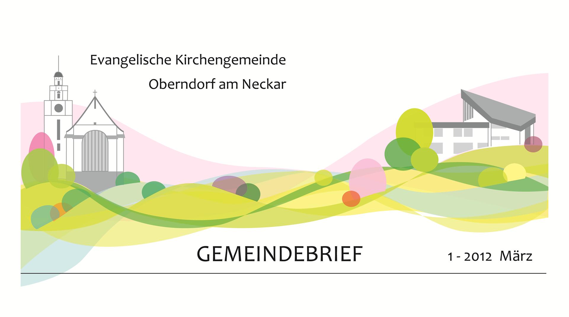
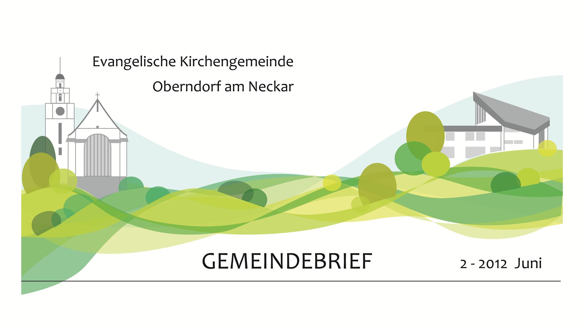
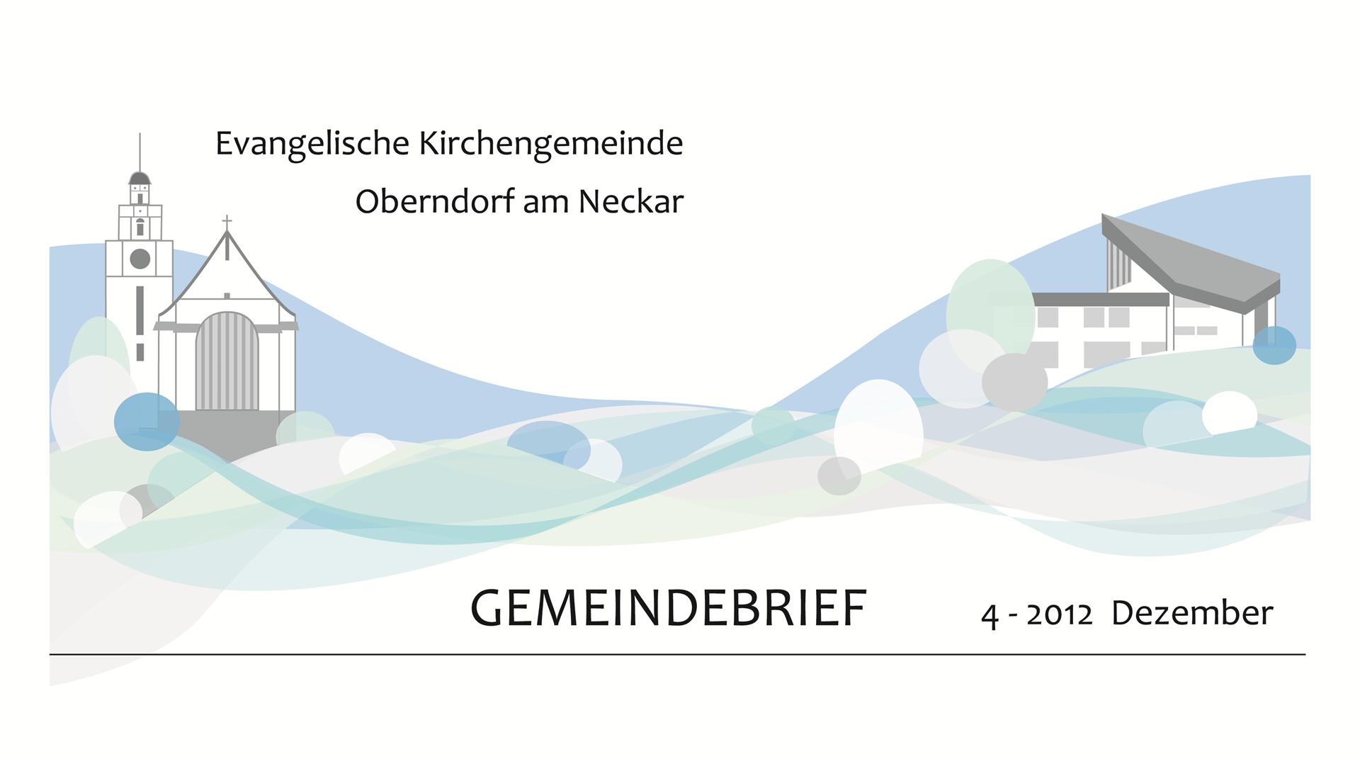
The overall design was supposed to stay with the church on the left and the community centre on the right with a bit of green to connect them in the middle.
I decided to use a vector illustration style, even though it is not something that I do a lot of, because I thought it would make the best solution for this project.
The final design shows a clean straight lined illustration of the two buildings on the left and right side of the banner and waves of different colours that bind them together. They are partially translucent and overlap so that the different colours change frequently. The upwards swing of the “hills” in combination with the light colours gives a dynamic, positive and at the same time modern look.
I also added some circles and ovals to represent bushes and trees. They open and break up the lines, so that it becomes loose and bouncy.
My last change was to give the type treatment a make over as well with a new layout and fontface.
I then had the great idea to simply change the colours of the waves in 4 different ways to imply the 4 different seasons. That way the illustration can change according to season and give another lift to the whole letter.
I got great feedback from it so far, so I’m looking forward to seeing the new letter soon!