Want to know what is going on at my packaging project I started in May?
Great progress has been made and we have locked down a concept now. I have created some hand drawn digital illustration work to go with a stark black and white typography concept. It all looks classy and home made simultaneously, a “we make our own food, but it’s to a high standard” feel.
The name has been changed as well from “Delishh…” to a more unique and defining label called “Waikare Kitchen” which refers to the geographical origins of the brand.
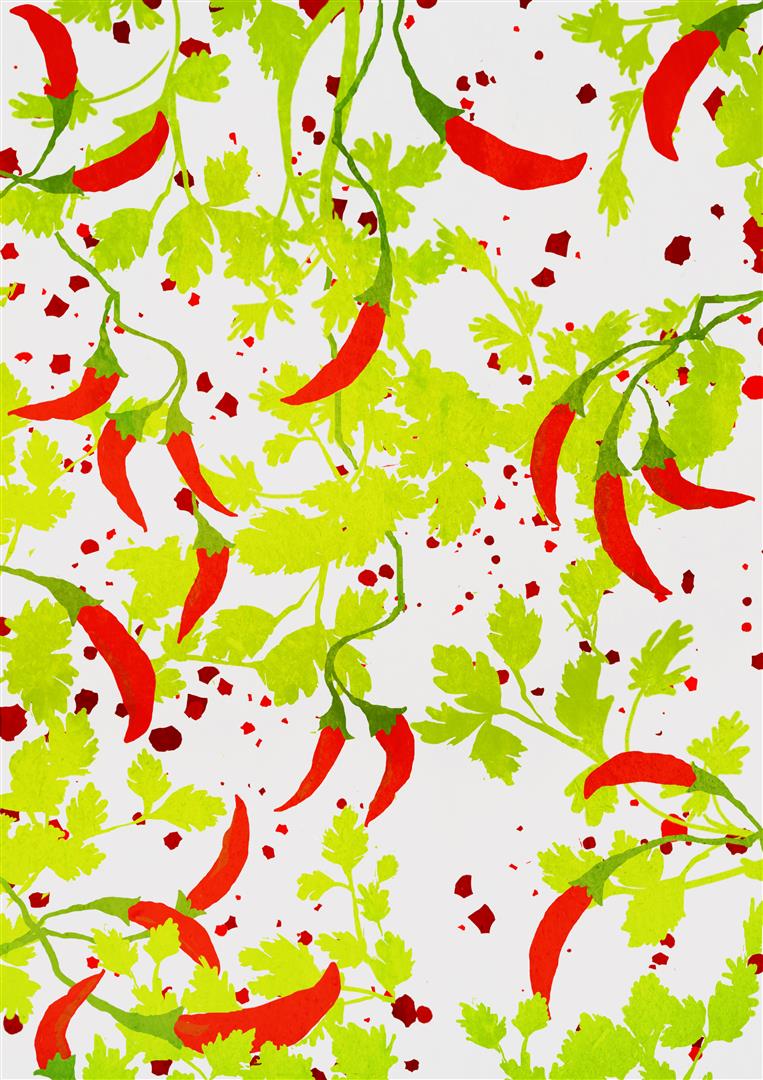
As we are getting closer to a refined final design and layout, I can’t show the complete work until the product has been released, but I thought I’ll give you a sneak peek on the illustration work with one of the patterns (that is for one of the sauce paste flavours) I have created: